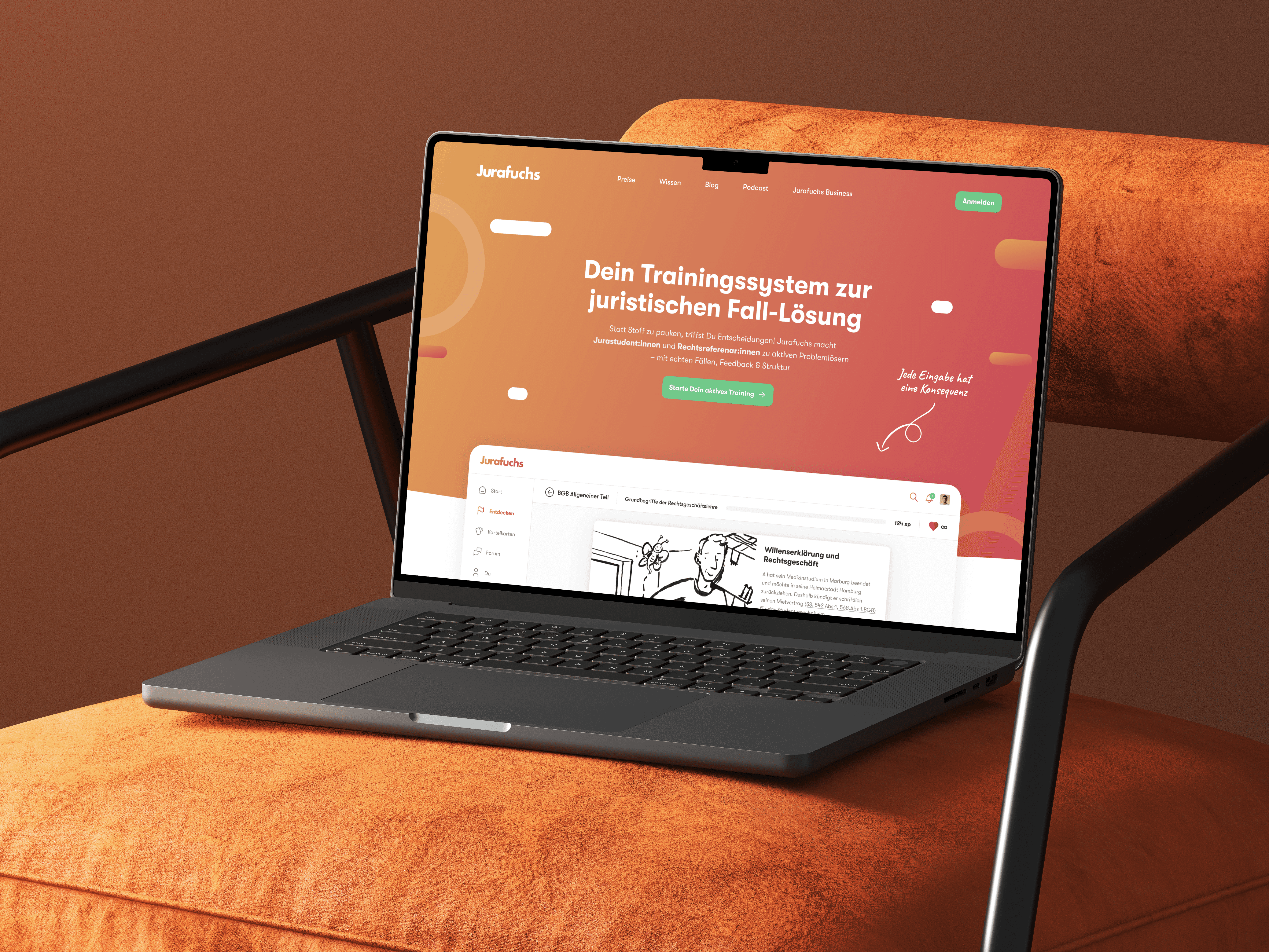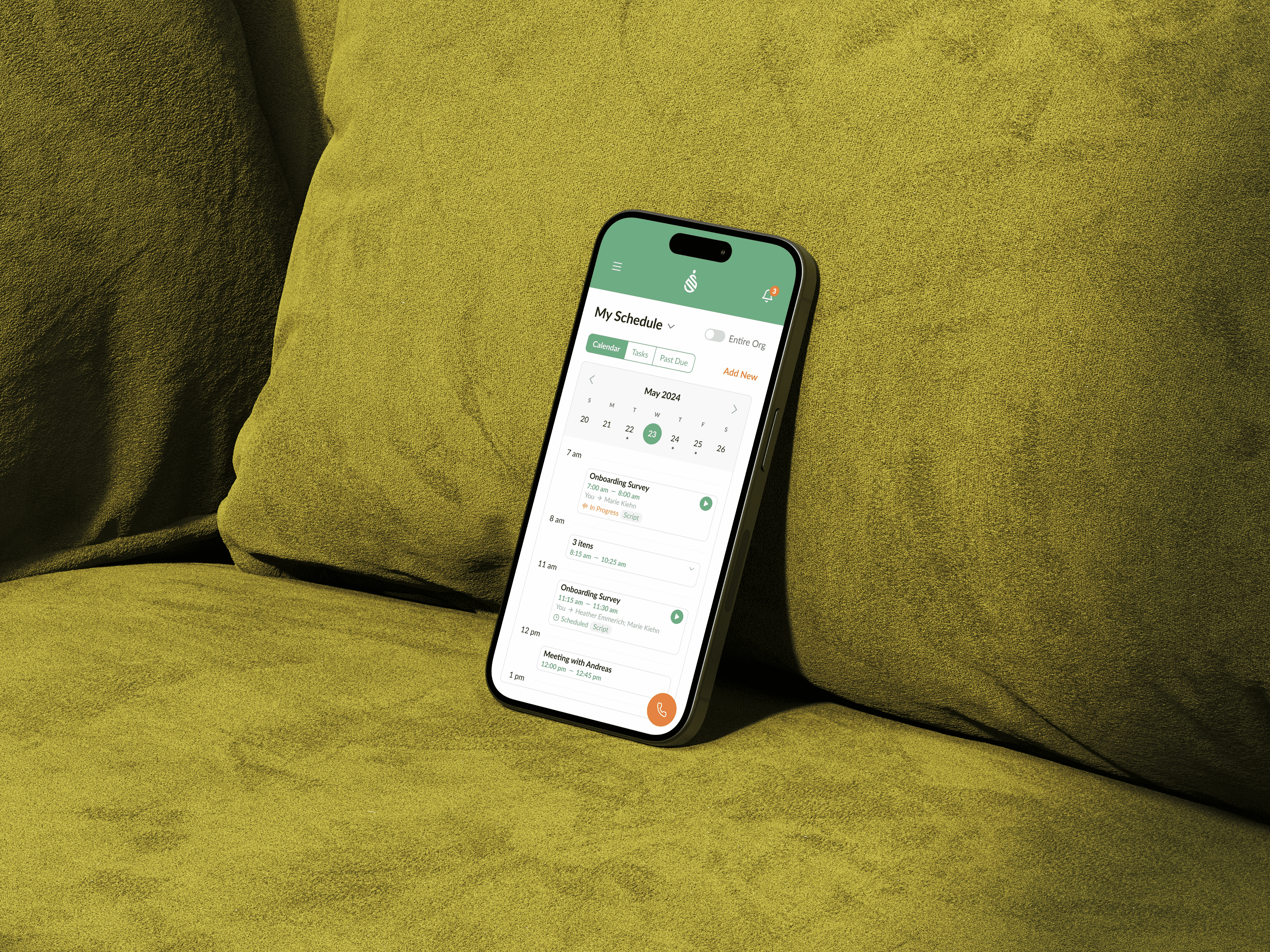

Process
Discovery & Process Mapping
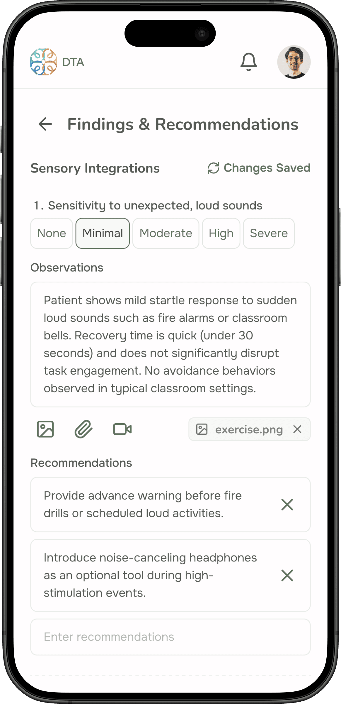
The first step was understanding DTA’s world in depth. I conducted in-depth sessions with the therapist to map her entire assessment process — studying the forms she used, the logic behind each question, and how answers guided her diagnosis. This wasn’t a surface-level discovery; it required learning enough about the clinical domain to make informed design decisions.
This phase uncovered the biggest pain points: the therapist was spending hours on administrative tasks that could be automated, and patient information was fragmented across emails, calls, and paper forms with no centralized access.
Definition & Information Architecture
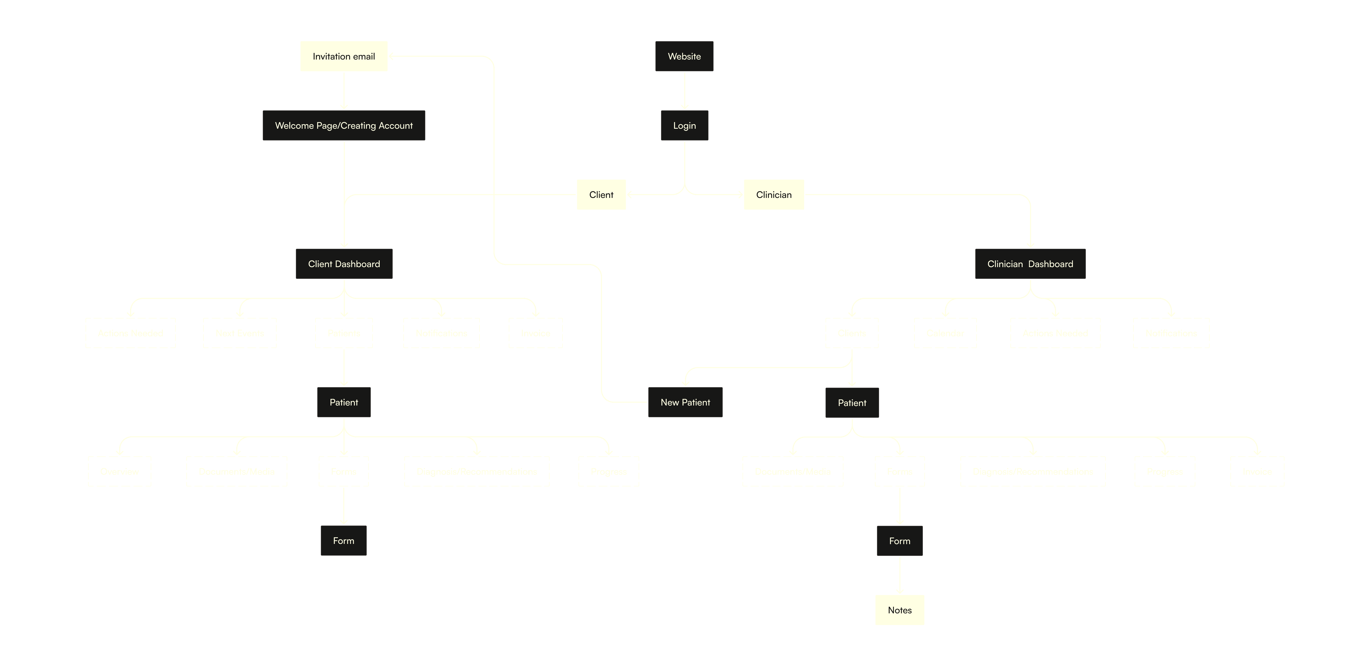
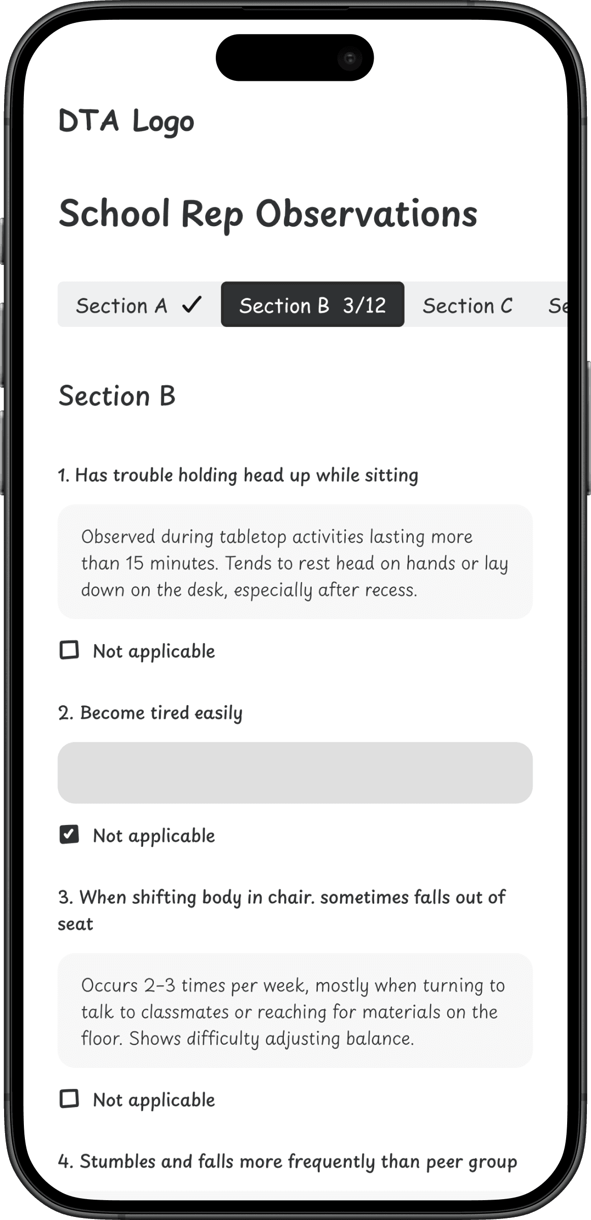
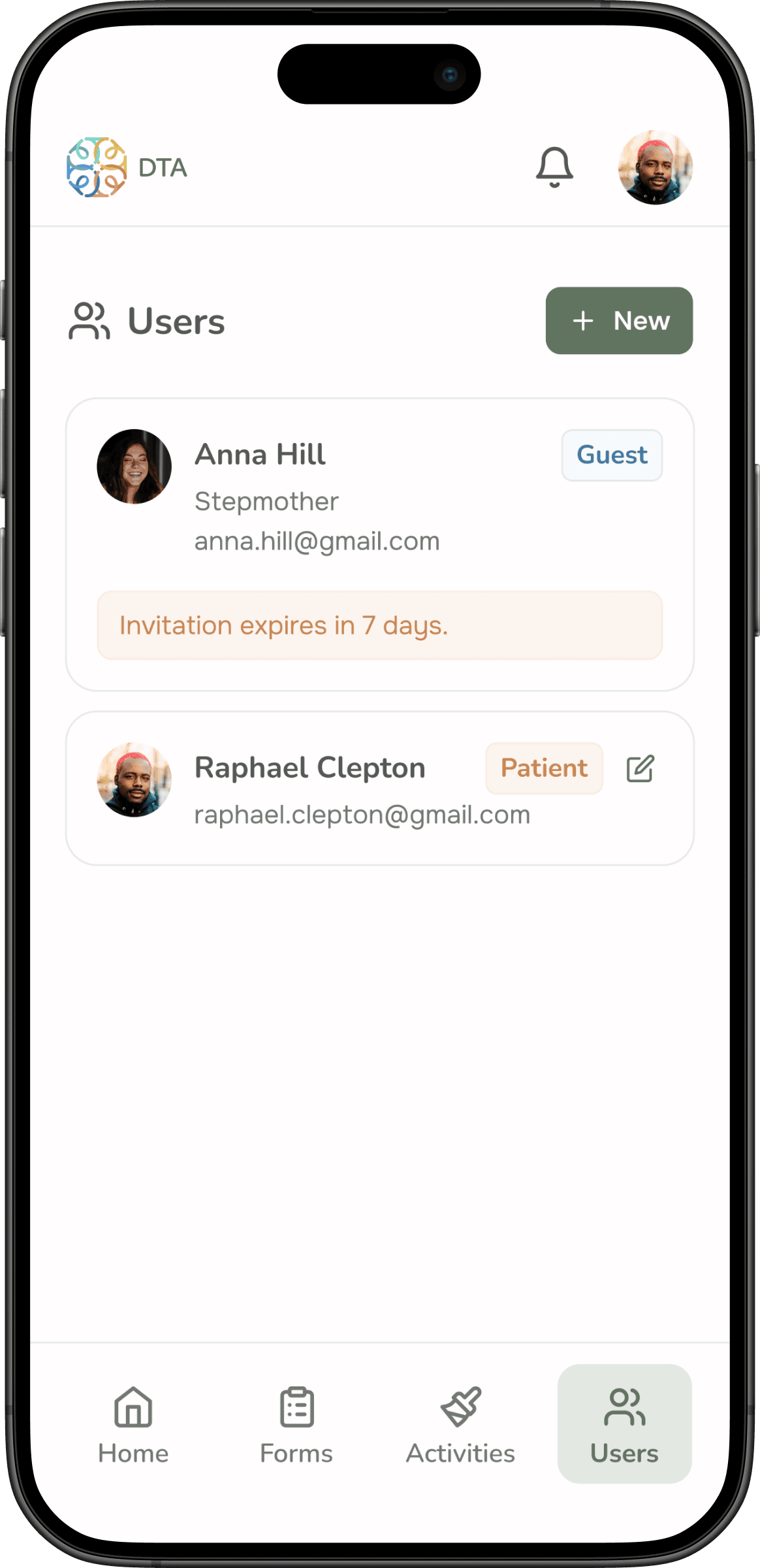
With a clear picture of the workflow, I defined two primary personas: the Clinician (the therapist managing assessments) and the Client (patients or their guardians filling out forms and accessing results). From there, I built the sitemap and designed user flows for the most critical tasks — filling out an assessment form, inviting a new user, and managing permissions.
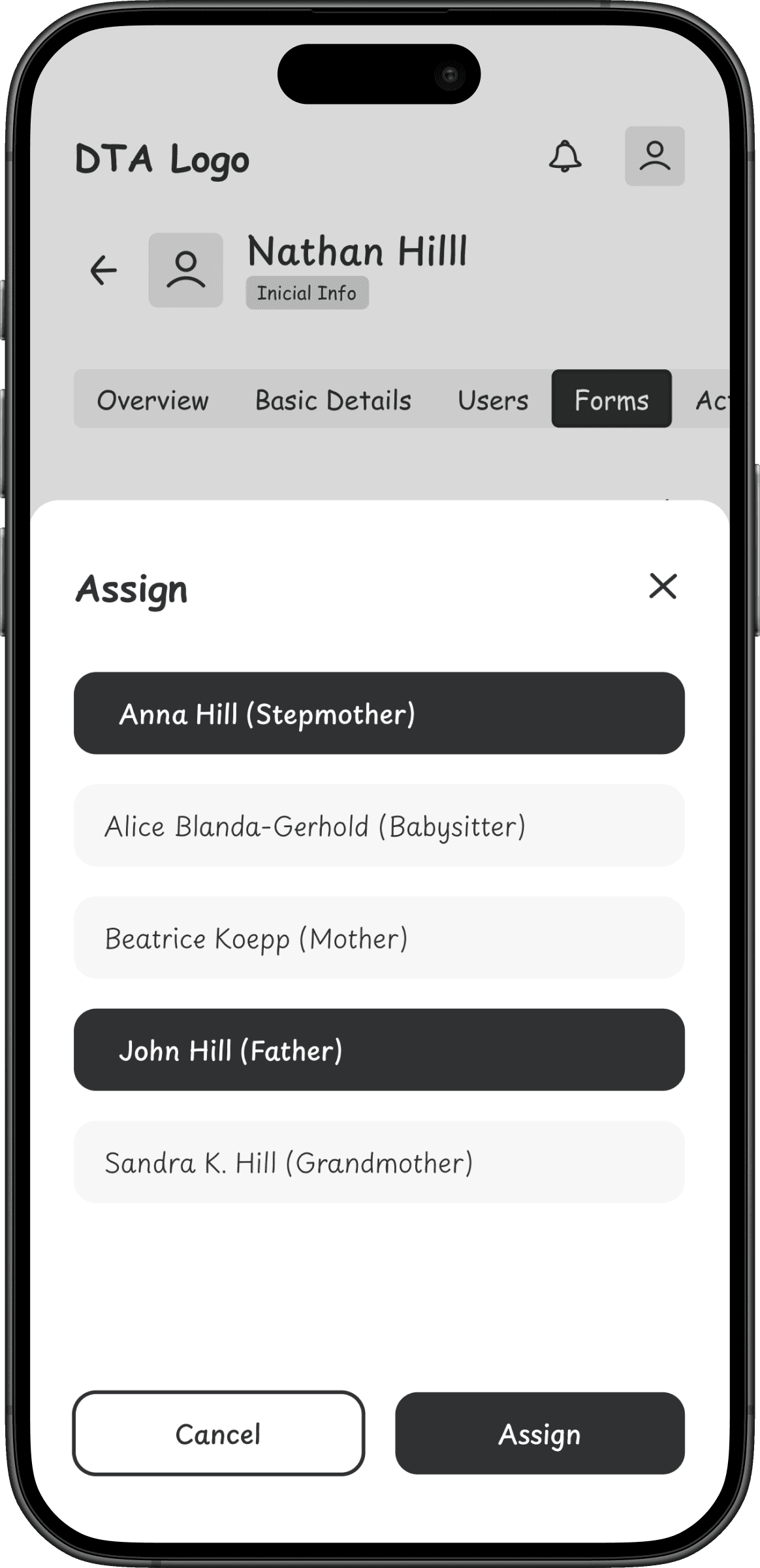
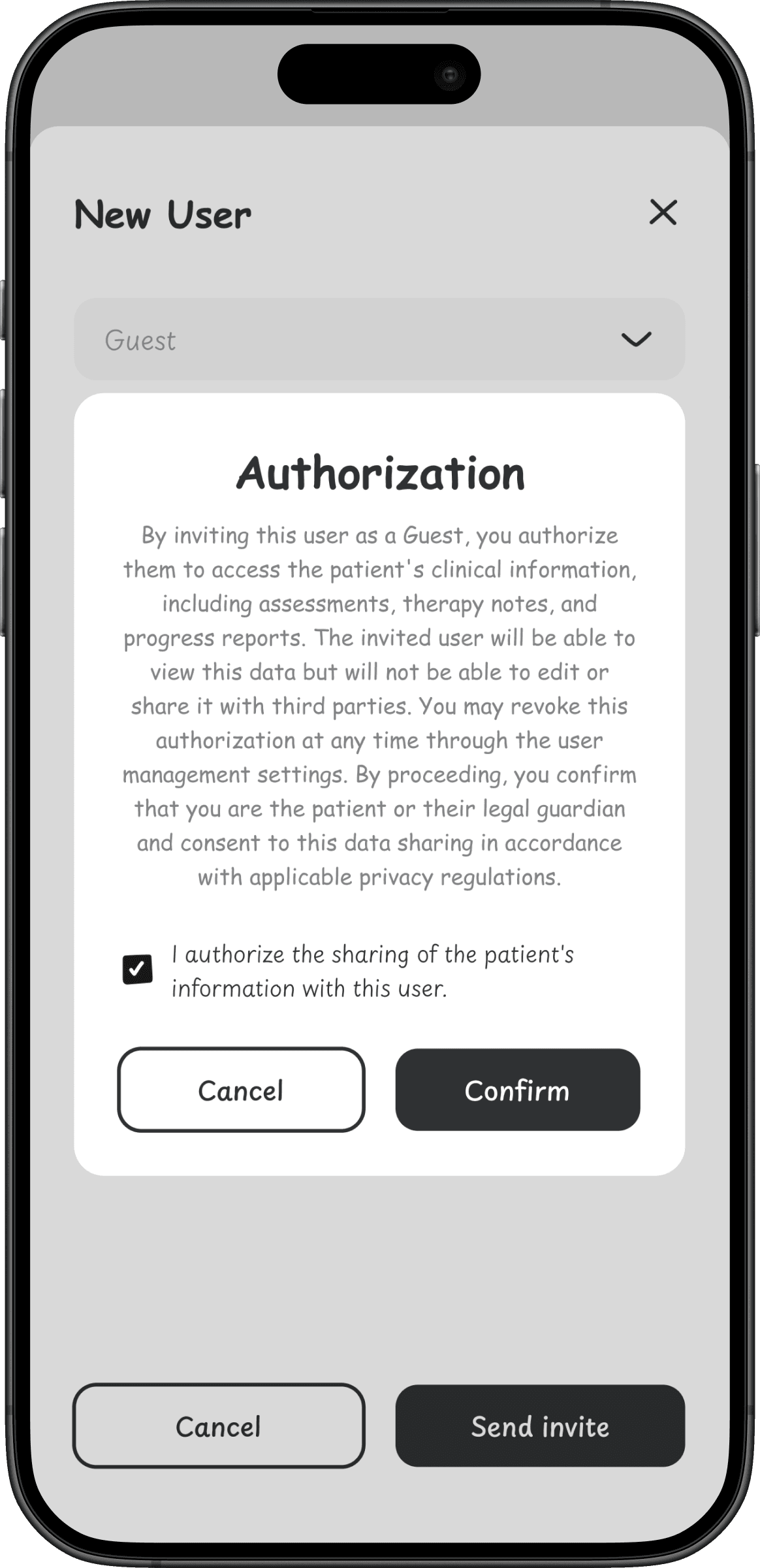
A key design challenge was the permissions system. Because this platform handles sensitive health data about children, every access point needed granular consent controls. The therapist had to be able to invite other professionals (doctors, teachers) to view specific information, always with the guardian’s explicit consent.
Wireframing & Responsive Design
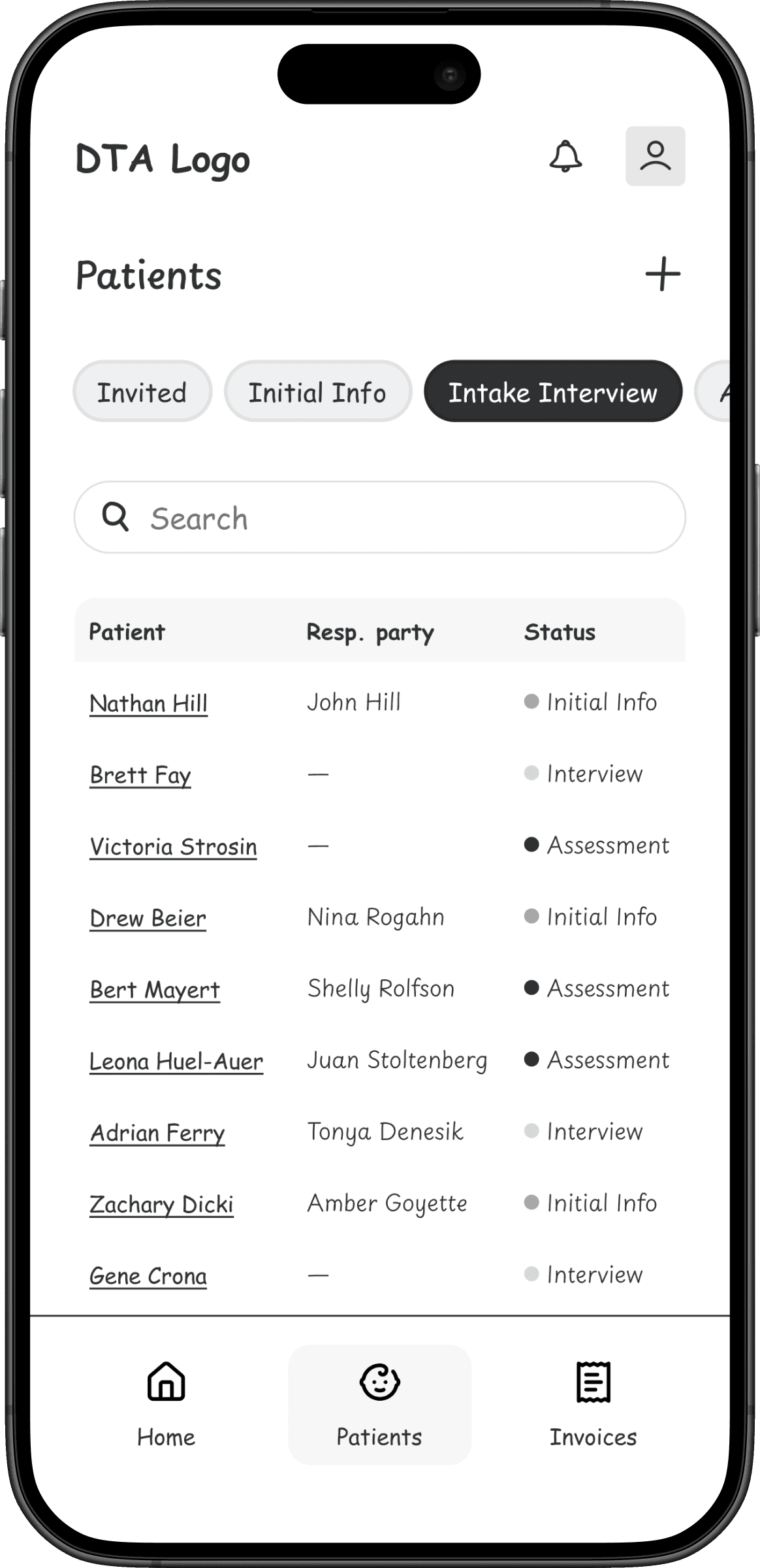
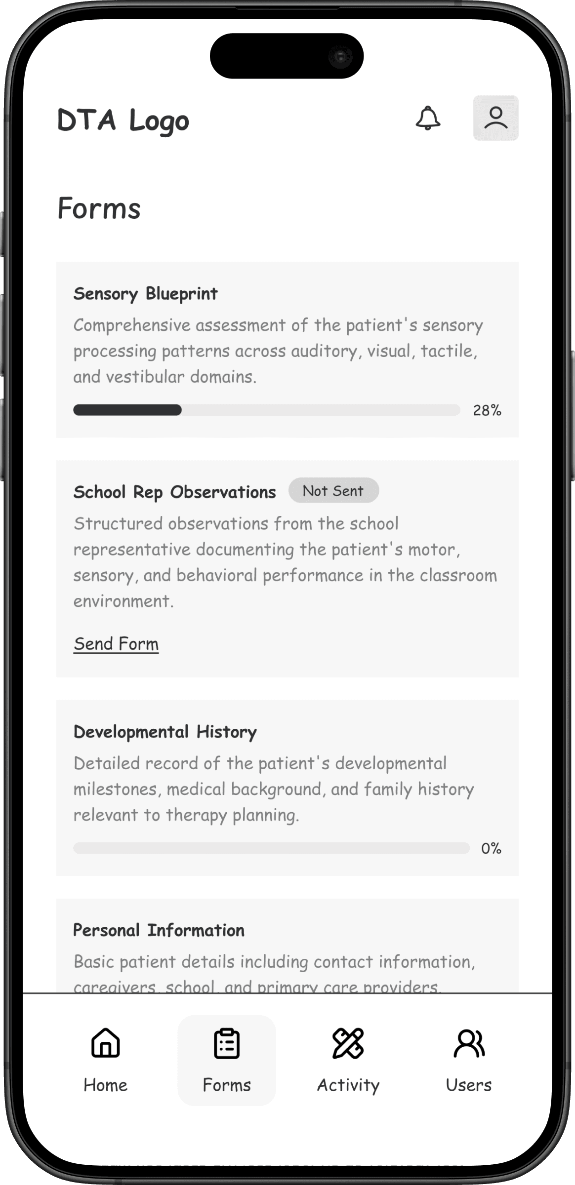
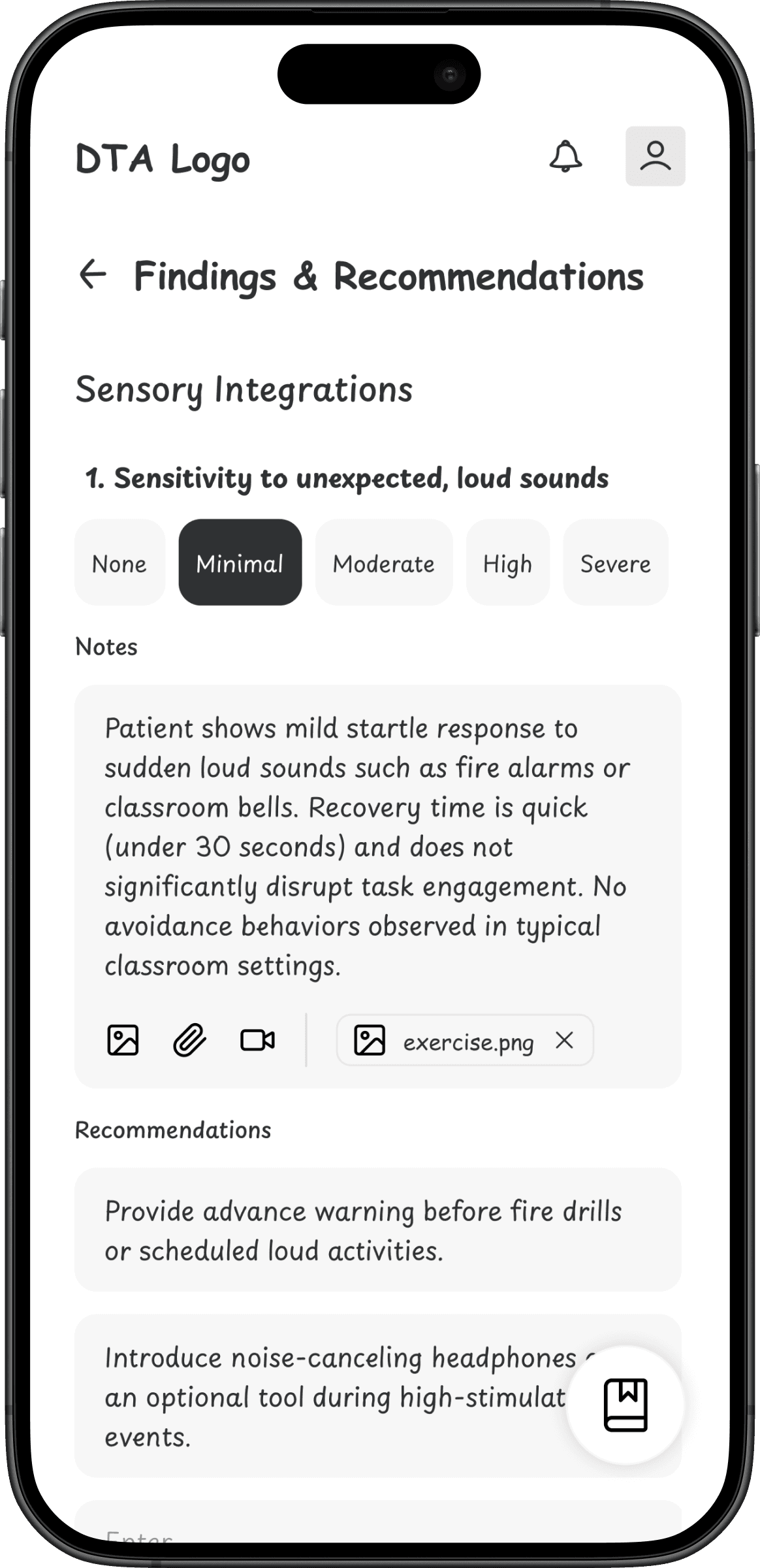
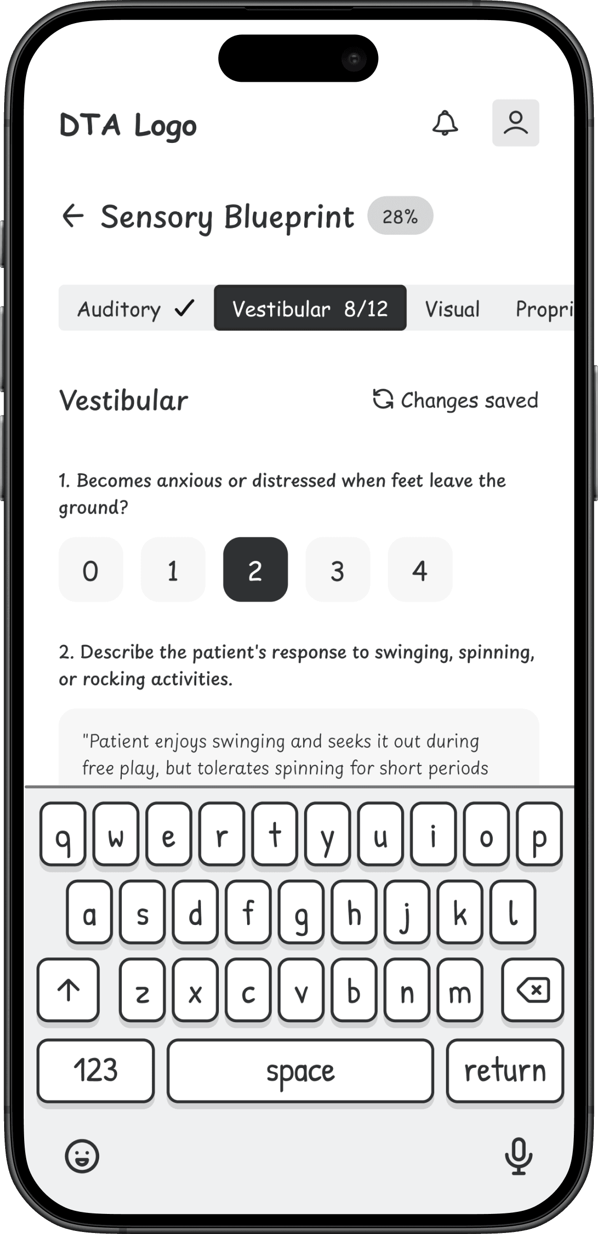
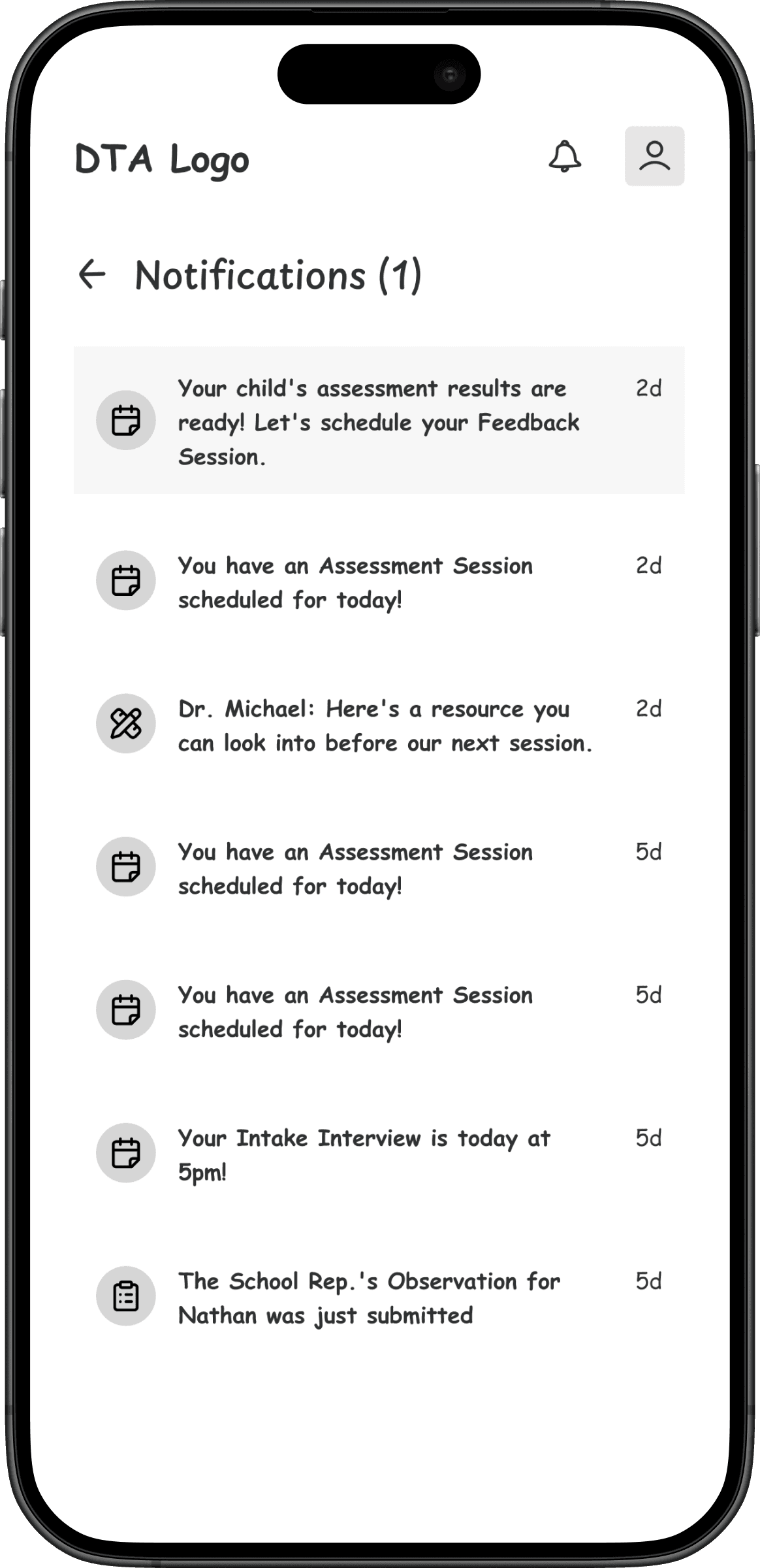
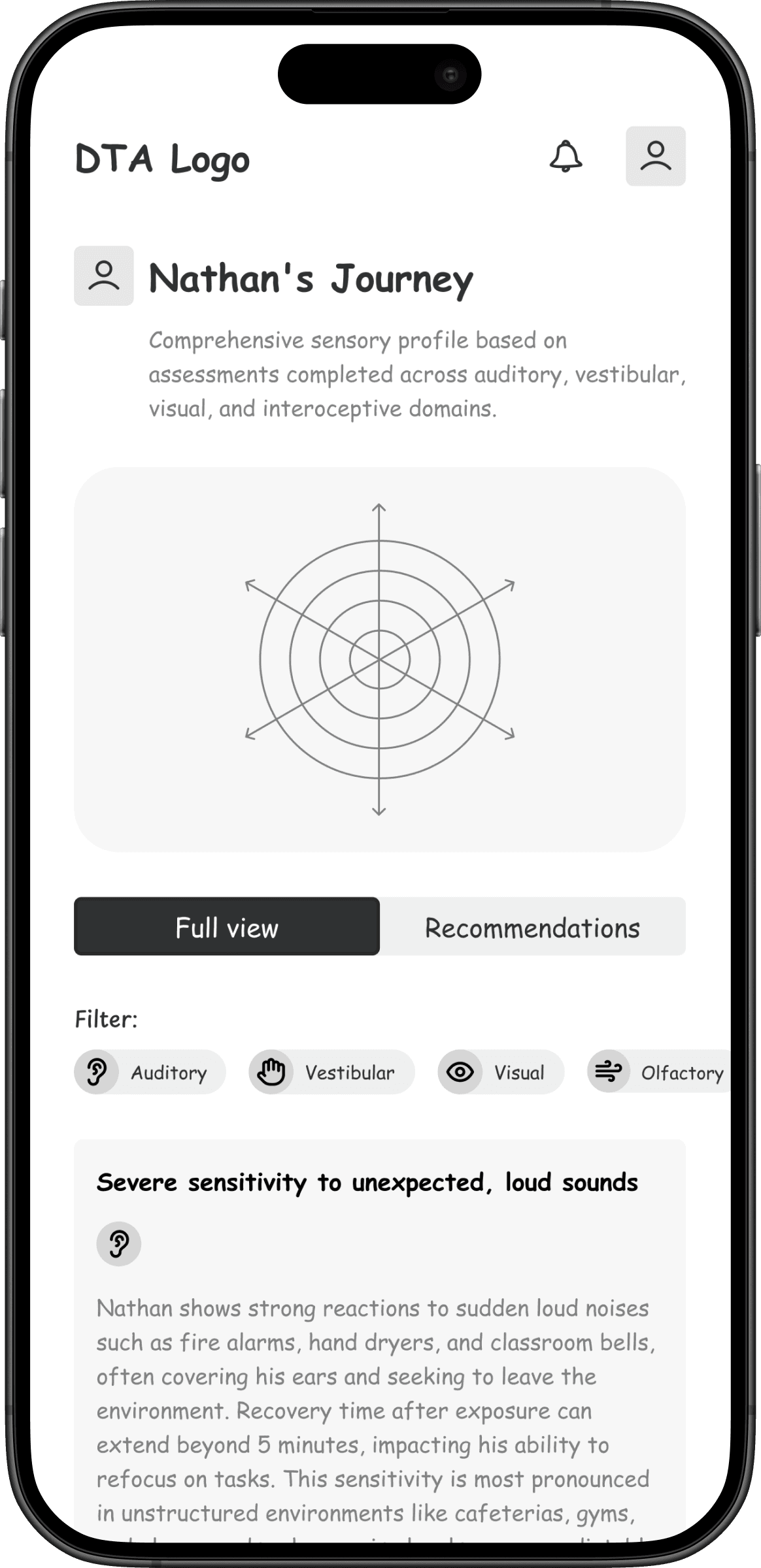
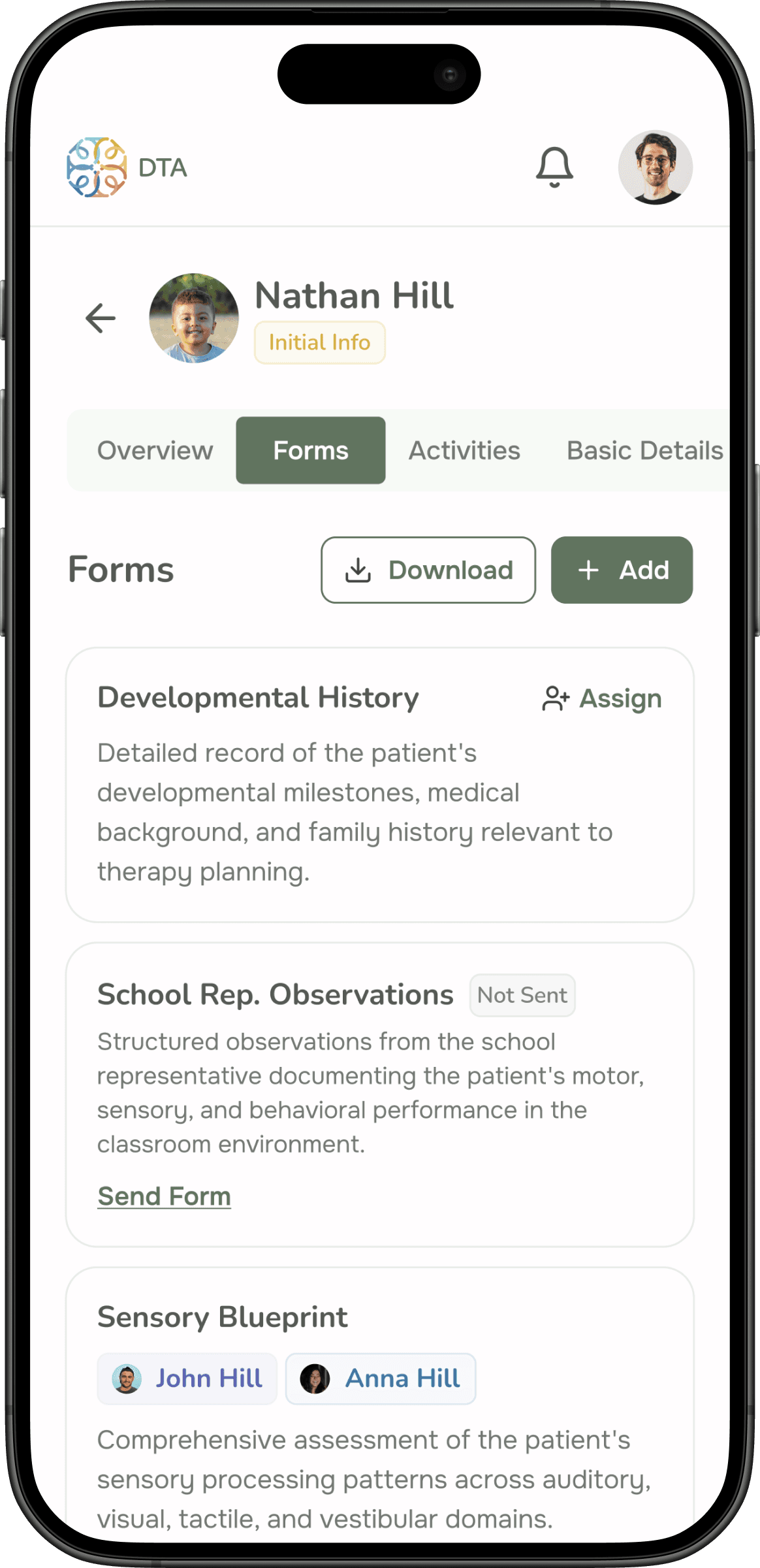
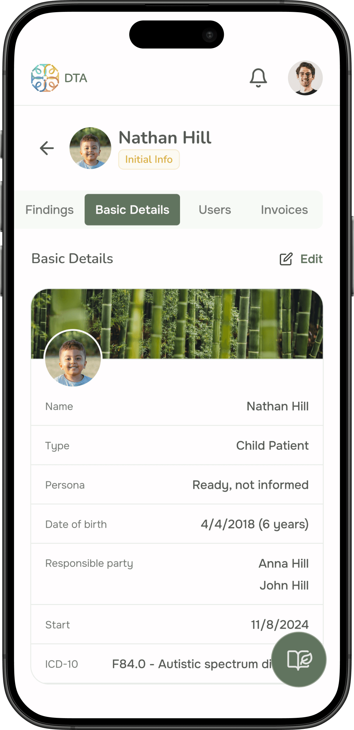
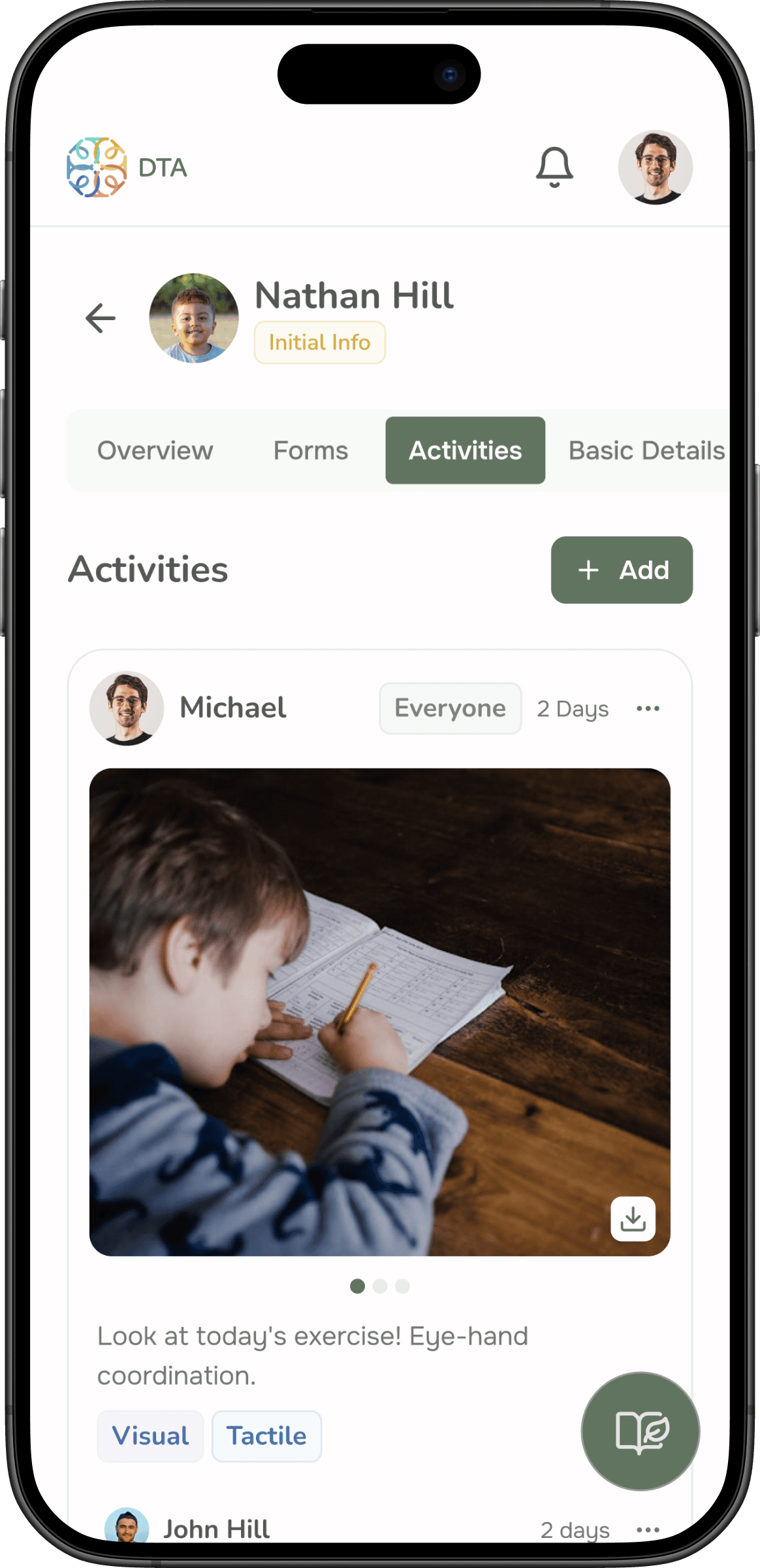
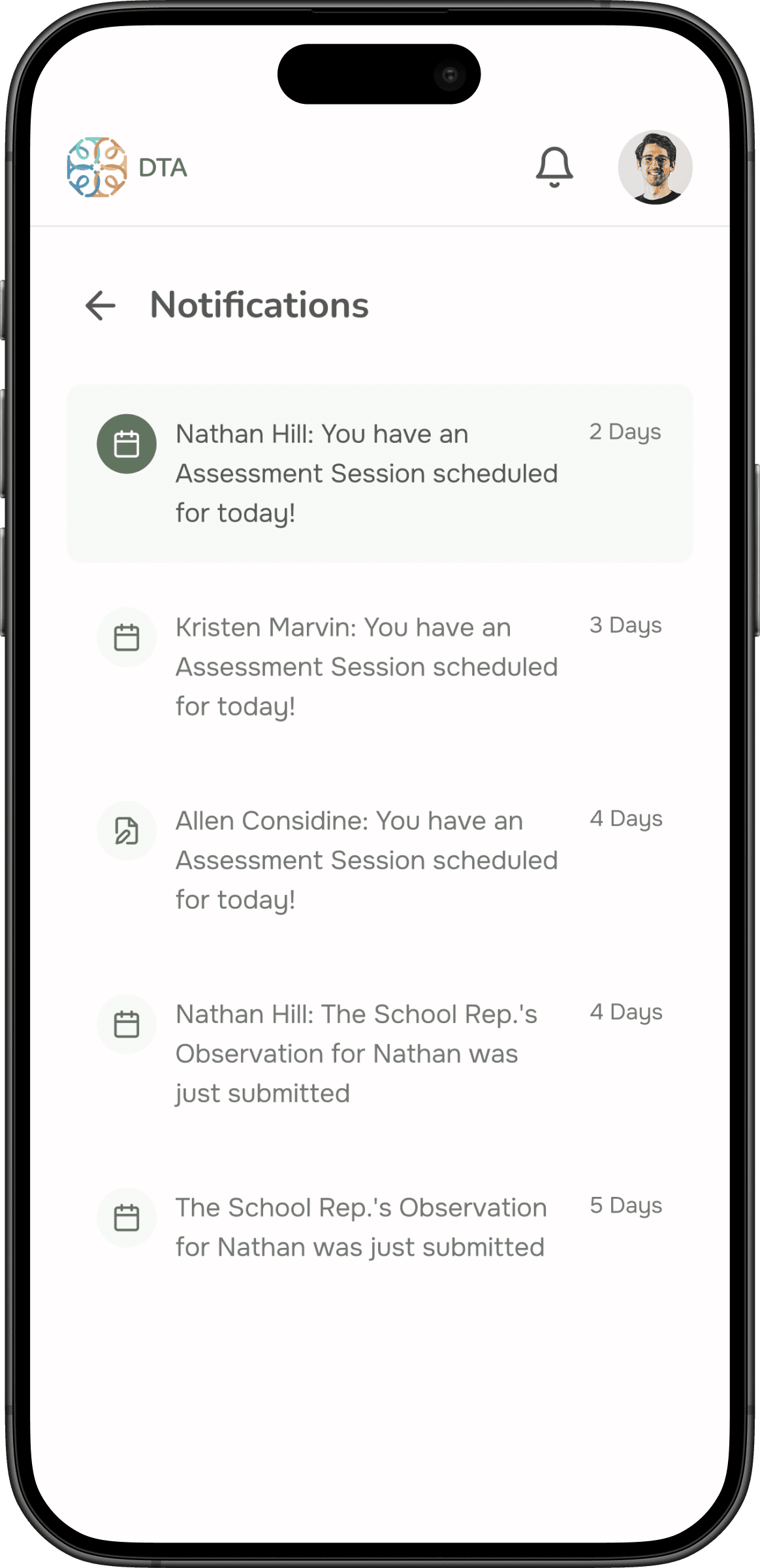
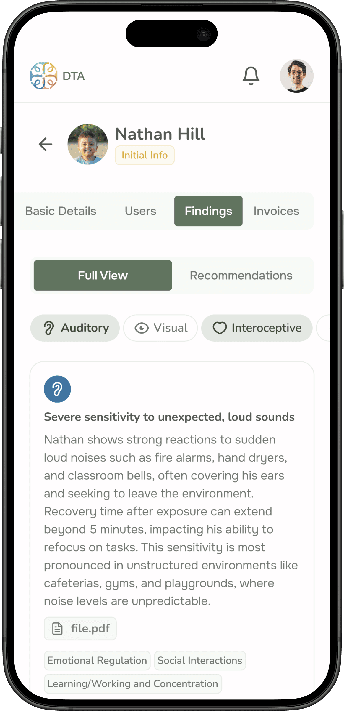
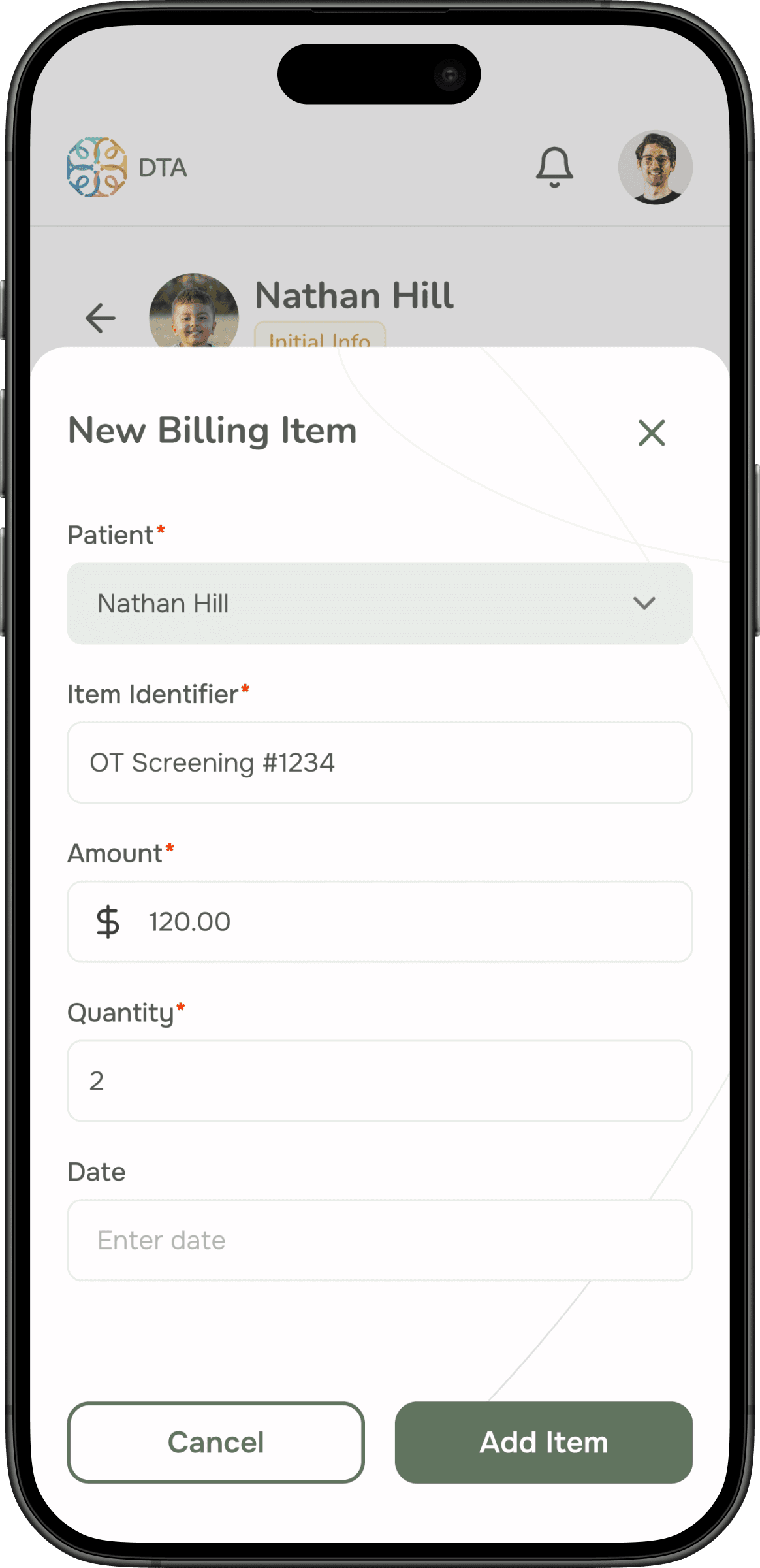
A core requirement was that the platform had to work seamlessly on any device — therapists might use it on a desktop in the office, a tablet during a session, or a phone between appointments. I created detailed wireframes for all three breakpoints, ensuring a consistent and intuitive experience across every screen size.
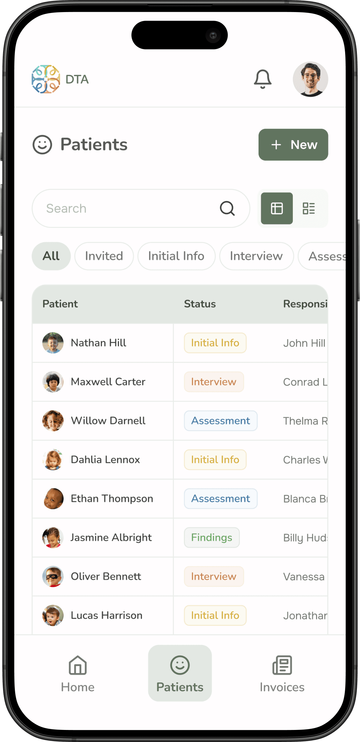
This wasn’t just about responsive layout. Each breakpoint required rethinking what information was most important in that context. The mobile view, for example, prioritized quick-glance patient status, while the desktop view surfaced the full assessment detail.
Visual Design & Prototyping
I developed a visual concept that conveys trust, care, and professionalism — essential qualities for a healthcare platform. The color palette, typography, and graphic elements were chosen to create a clean, accessible interface that doesn’t overwhelm users who may not be tech-savvy.
I built a style guide to ensure consistency, then applied it across all screens. The final high-fidelity prototype was used to validate the navigation flow and usability with the client before development, which minimized rework and ensured alignment.
Results & Impact
The platform is currently in development. The close collaboration with the client throughout the process — from discovery to prototype validation — was the key to exceeding expectations. The therapist got a tool designed around her actual workflow, and Atom6 earned a new engagement from the strength of the relationship built during this project.
Breakpoints
3
New contract
1
Personas
5
Insights
Designing for sensitive data changes everything. Working with children’s health information meant that privacy and security considerations shaped every design decision from the very first draft — not as an afterthought, but as a foundational constraint. Building clear consent flows and granular permission controls was as important as the UI itself.
This project also reinforced that in specialized domains, the client is the true subject matter expert. Working side-by-side with the therapist was the most effective way to translate a complex clinical process into a simple, intuitive interface. The best design decisions came from deeply understanding her world, not from applying generic UX patterns.