Process
Deconstructing the Desktop Experience
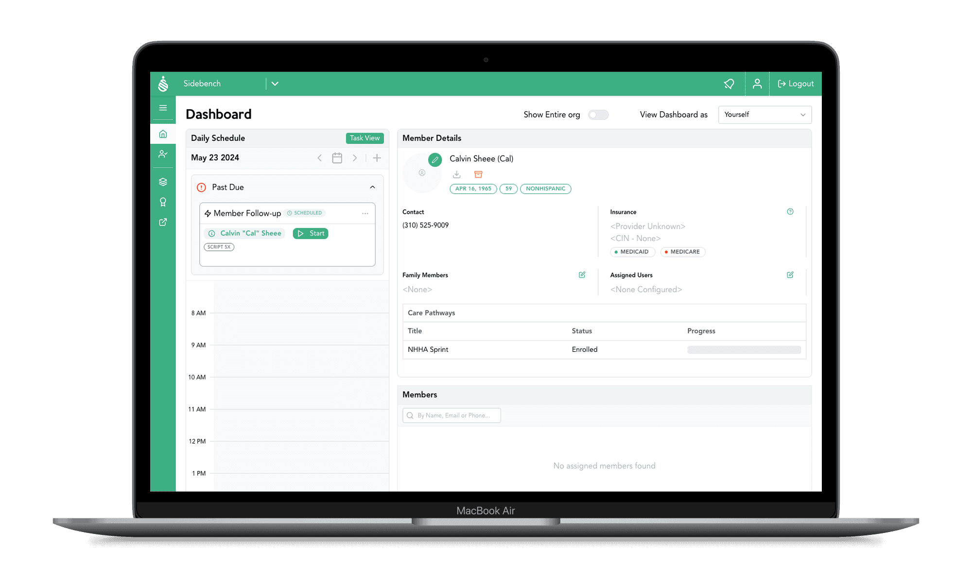
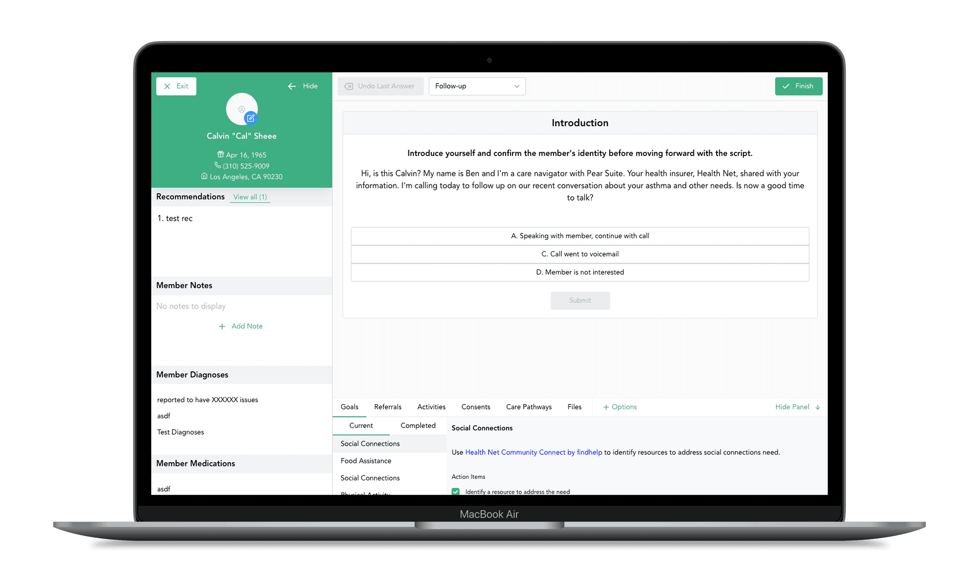
Before designing anything new, I needed to deeply understand what already existed. I conducted a complete analysis of the web application, mapping every critical user flow and identifying the screens with the highest information density.
Simultaneously, I audited the platform’s visual patterns. I cataloged existing styles and created a formal style guide — defining the typographic scale, color palette, and icon library. This document became the foundation for ensuring visual consistency between desktop and mobile, and it didn’t exist before this project.

Rethinking Hierarchy for Mobile
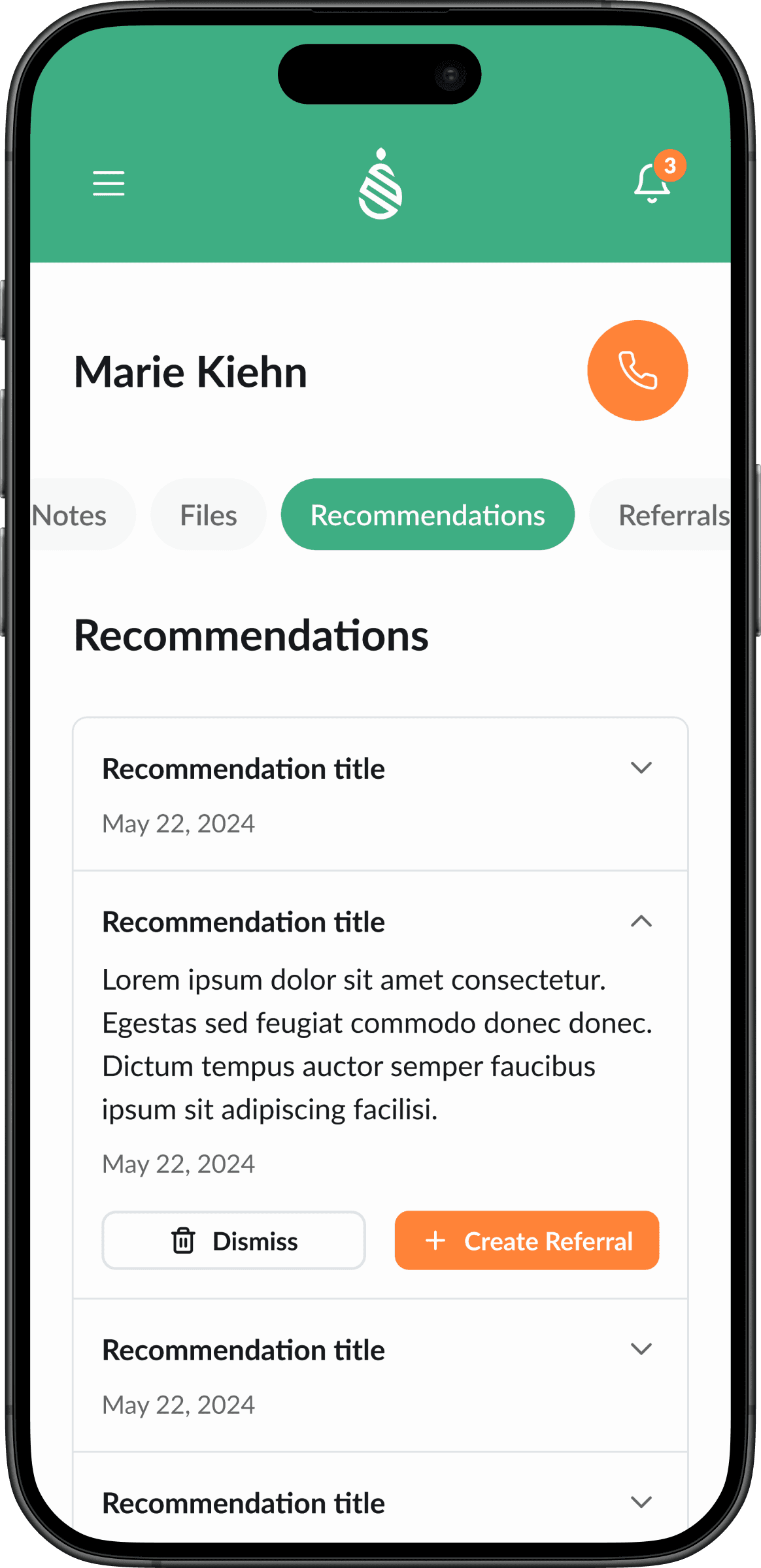
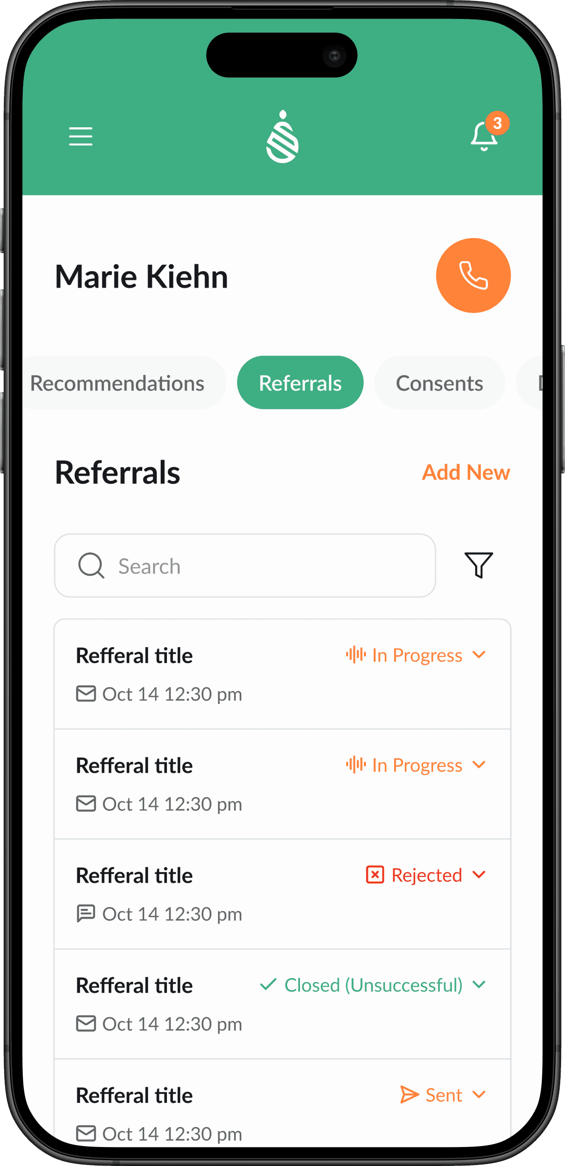
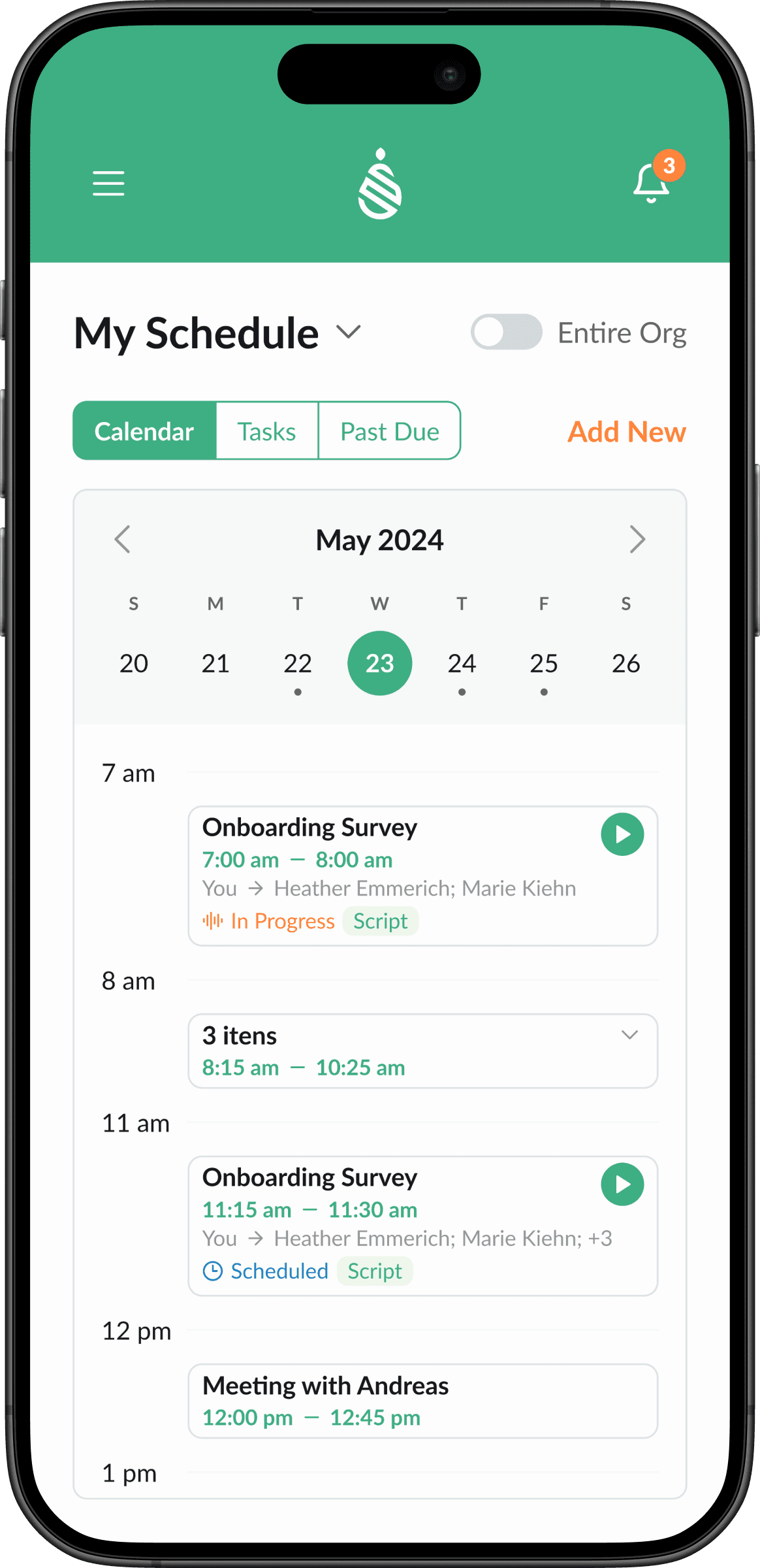
With the platform fully mapped, I shifted to designing the mobile experience. The guiding question for every screen was: “What is the most important information for a health worker in the field right now?”
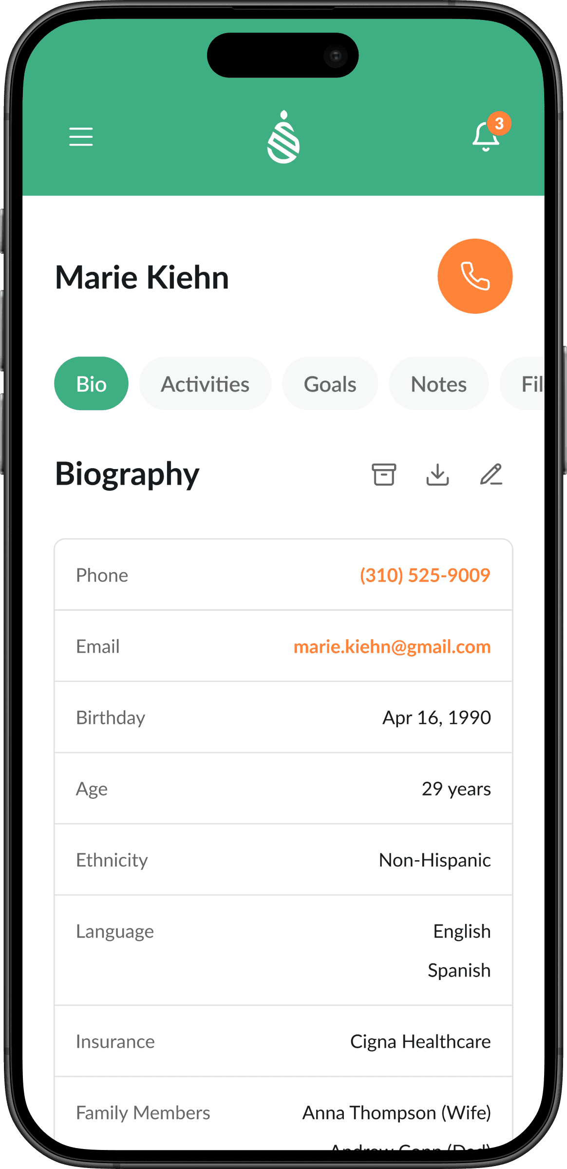
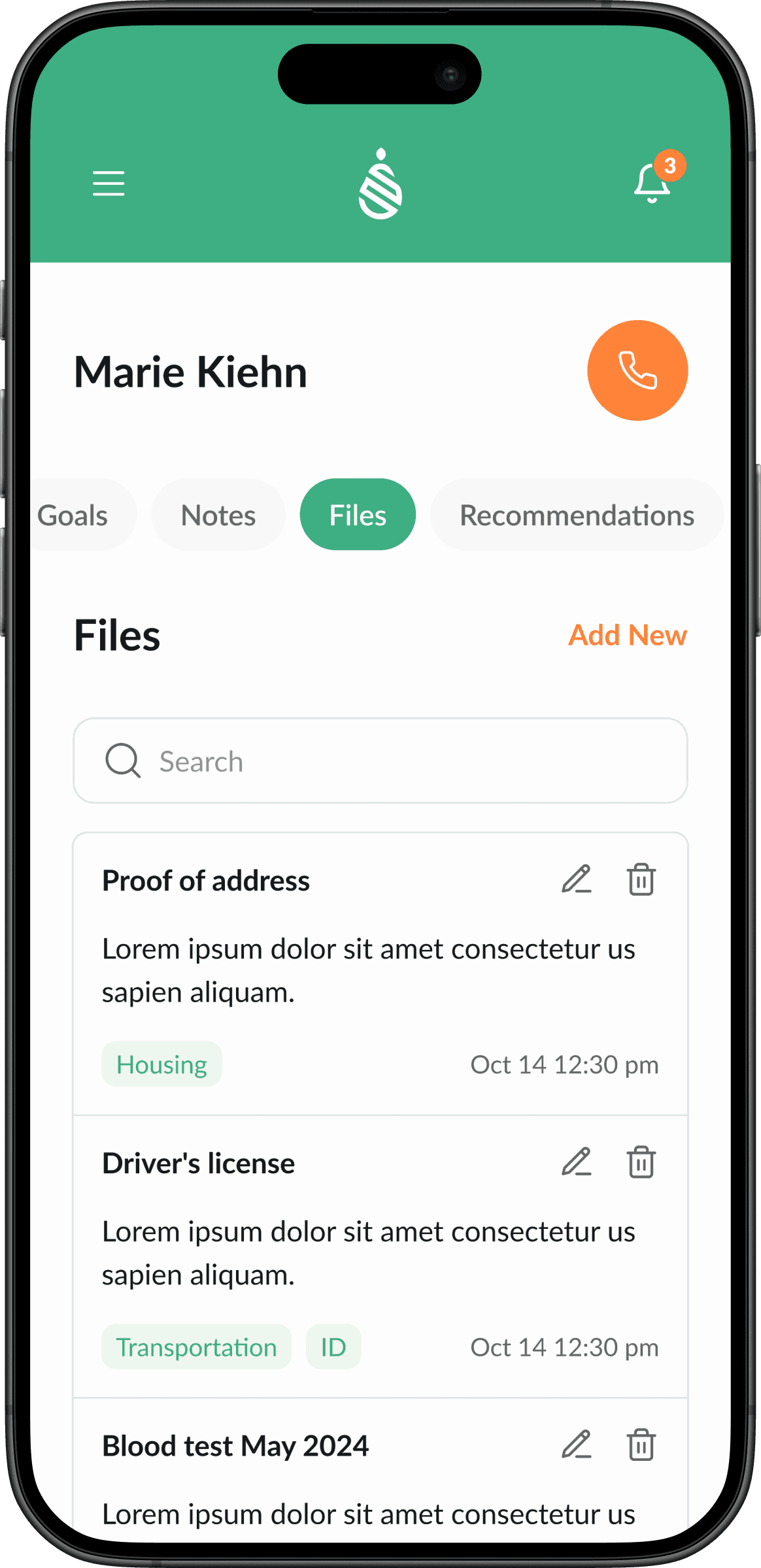
This meant making hard prioritization calls. Not everything that lives on desktop belongs on mobile. I reorganized content hierarchies, simplified navigation patterns, and designed progressive disclosure so users could drill into details when needed without being overwhelmed at first glance.
Proposing Usability Improvements
The adaptation process naturally surfaced opportunities to improve the overall experience — not just for mobile, but for the product as a whole. Instead of limiting myself to a strict “adapt what exists” approach, I proposed new solutions where I saw friction.
These improvements were validated with the client through interactive prototypes. Being proactive about proposing value beyond the original scope reinforced my role as a strategic partner rather than an order-taker, and the client embraced every suggestion.
Final Interface & Delivery
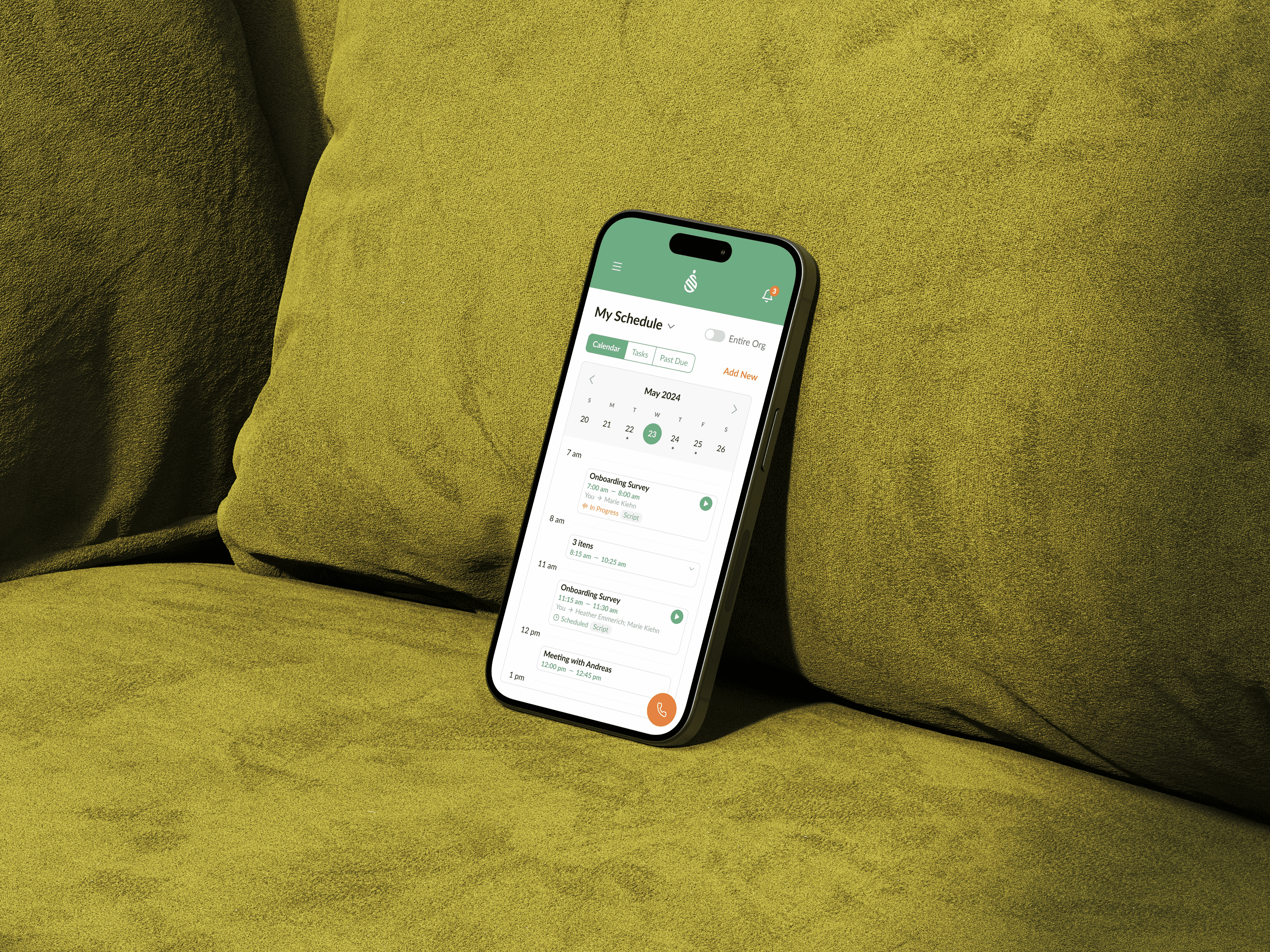
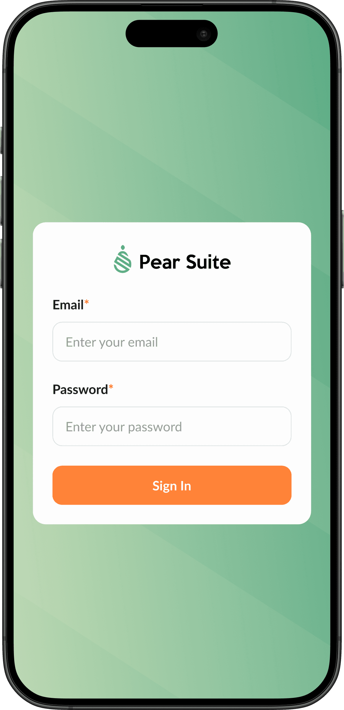
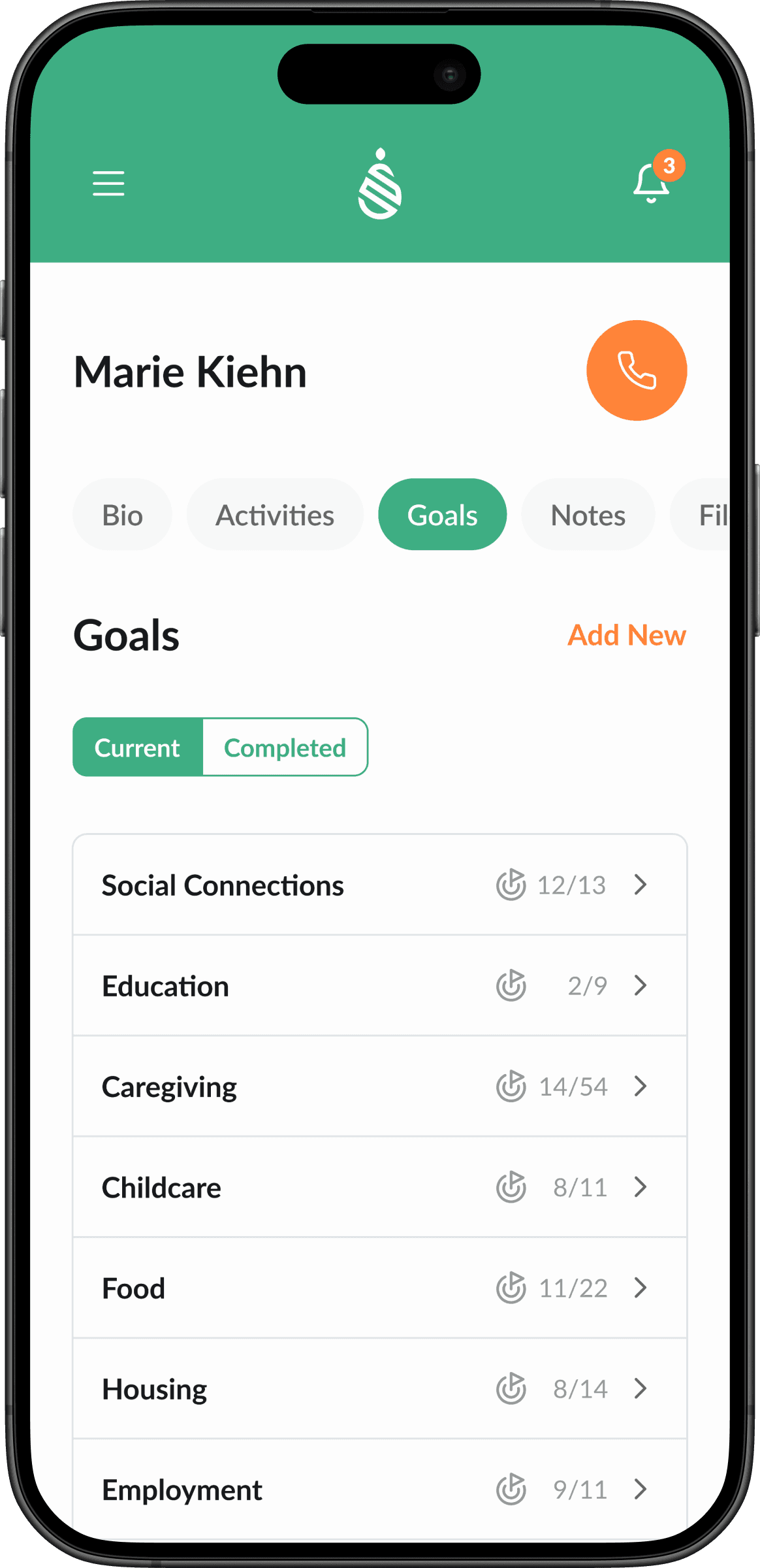
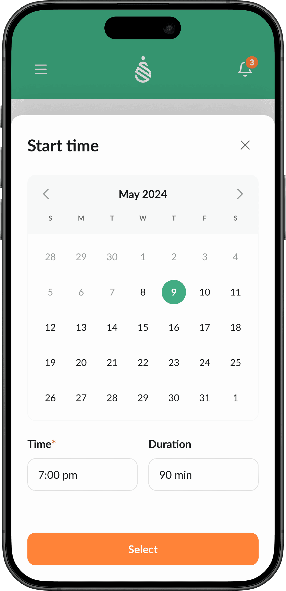
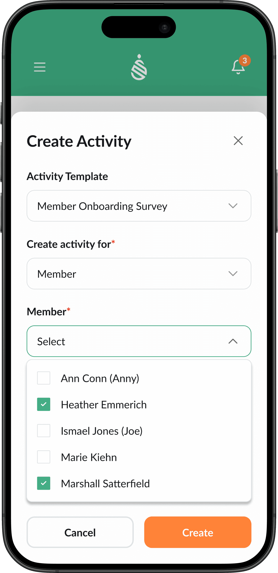
I applied the style guide to all wireframes, refined every component for consistency and accessibility, and delivered the complete set of high-fidelity mobile screens. The final product isn’t a copy of the desktop — it’s a functional, intelligent adaptation that makes the platform genuinely useful in the field.
Results & Impact
The mobile version gives community health workers a tool that actually works in the context they operate in — on the go, between patient visits, with limited time and attention. By treating the adaptation as a full redesign rather than a screen-shrinking exercise, the result is a product that’s not just smaller but genuinely better for its use case.
Redesign
Mobile
Style Guide
New
Prototype
Tested
Insights
This project proved that adapting a complex platform for mobile is a redesign, not a resizing exercise. You have to deconstruct what exists, understand its essence, and rebuild it for a completely different context of use. The screens that work best on mobile are the ones where I made the hardest prioritization decisions about what to show and what to hide.
It also reinforced the value of going beyond the brief. The original scope was a straightforward adaptation, but by proposing usability improvements along the way and validating them with the client, I delivered more value than expected and strengthened the partnership between the client and the studio.