Process
Market & User Research
The initial brief didn’t include a research phase. Through close communication with the client, I advocated for its importance — and it proved to be one of the most valuable decisions in the project.
I started with desk research, analyzing reports on Gen Z behavior and conducting a competitive analysis of platforms like Snapchat, BeReal, and Slowly. A key finding was that message scheduling was well established in professional tools but almost nonexistent for personal use — a clear opportunity. I also identified a similar app that had shut down, which signaled that execution and business model would be critical.
I then conducted qualitative interviews with young people aged 16 to 28 of different nationalities, using a script of 21 open-ended questions about their communication habits, friendship circles, and reactions to the idea of scheduled messages.
Design Principles
The research insights were translated into five design principles that guided every decision throughout the project:
Safety First: Messages exchanged only within small, trusted friend circles.
Personal & Visual: Focus on photos and text with a personal character — no mass messaging.
Continuous Engagement: Users can interact with the message “box” before and after opening it.
Focus on Positivity: Visual narrative centered on welcoming, positive communication.
Lightness & Performance: A fluid, fast interface — users reported uninstalling slow or cluttered apps.
Information Architecture & Wireframes
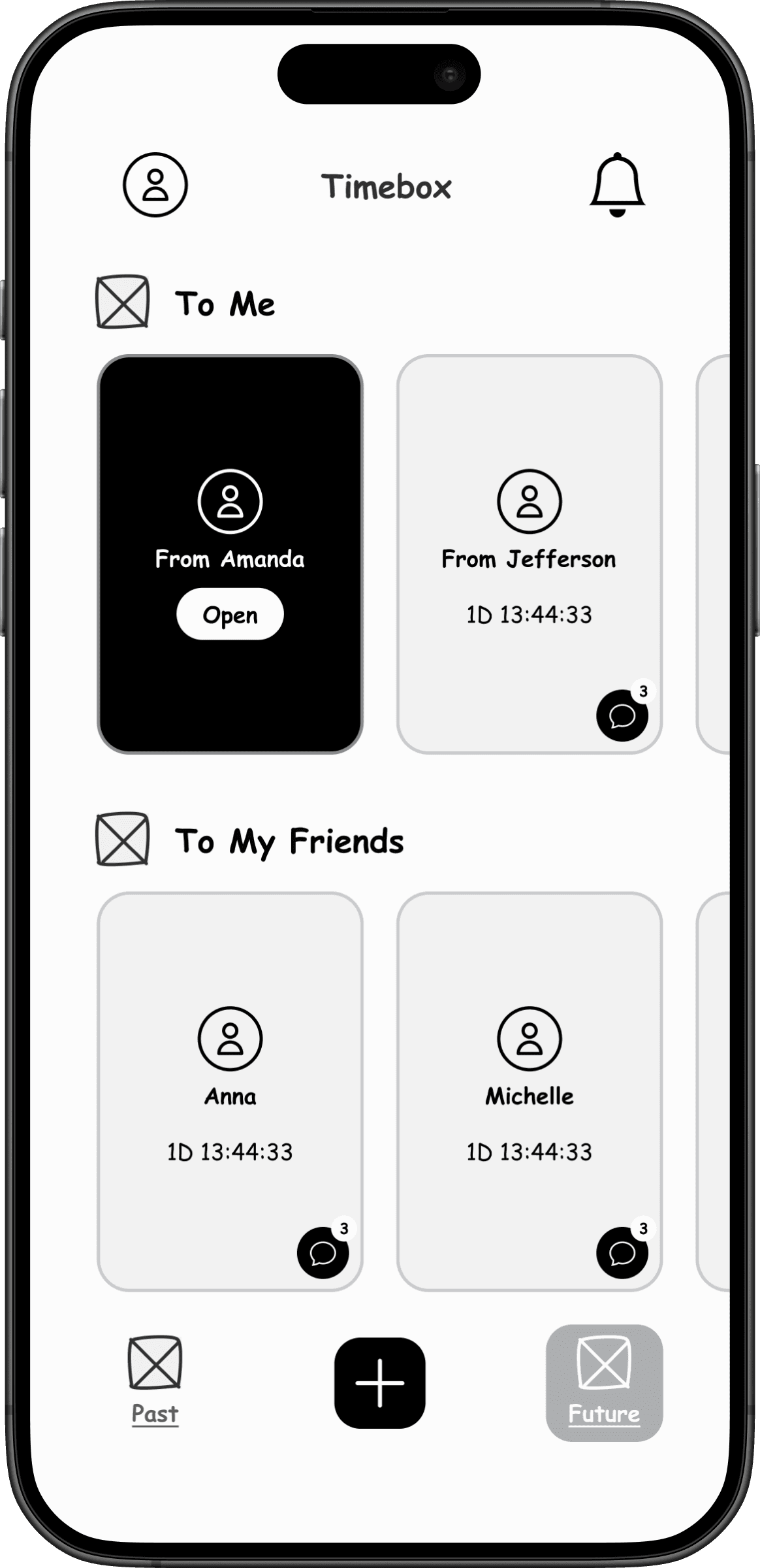
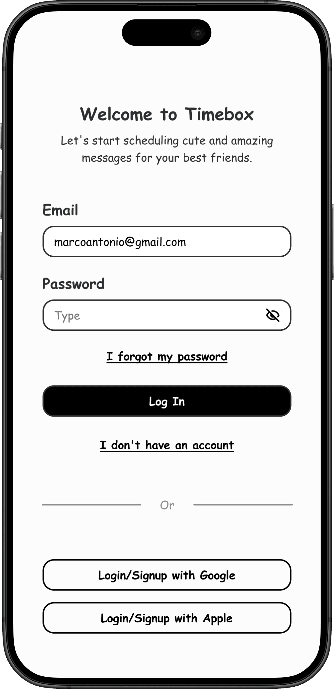
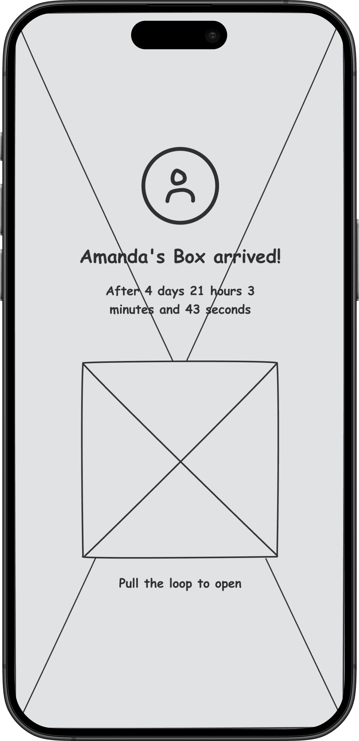
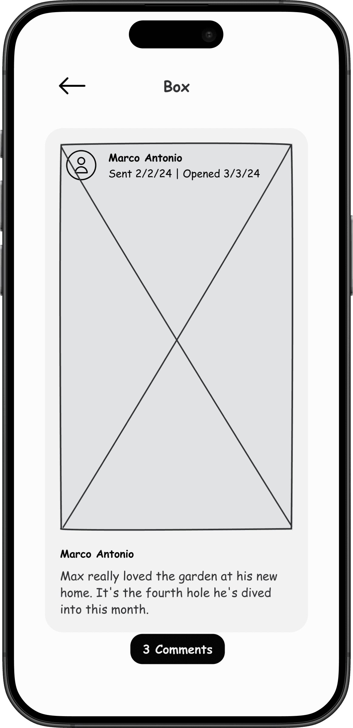
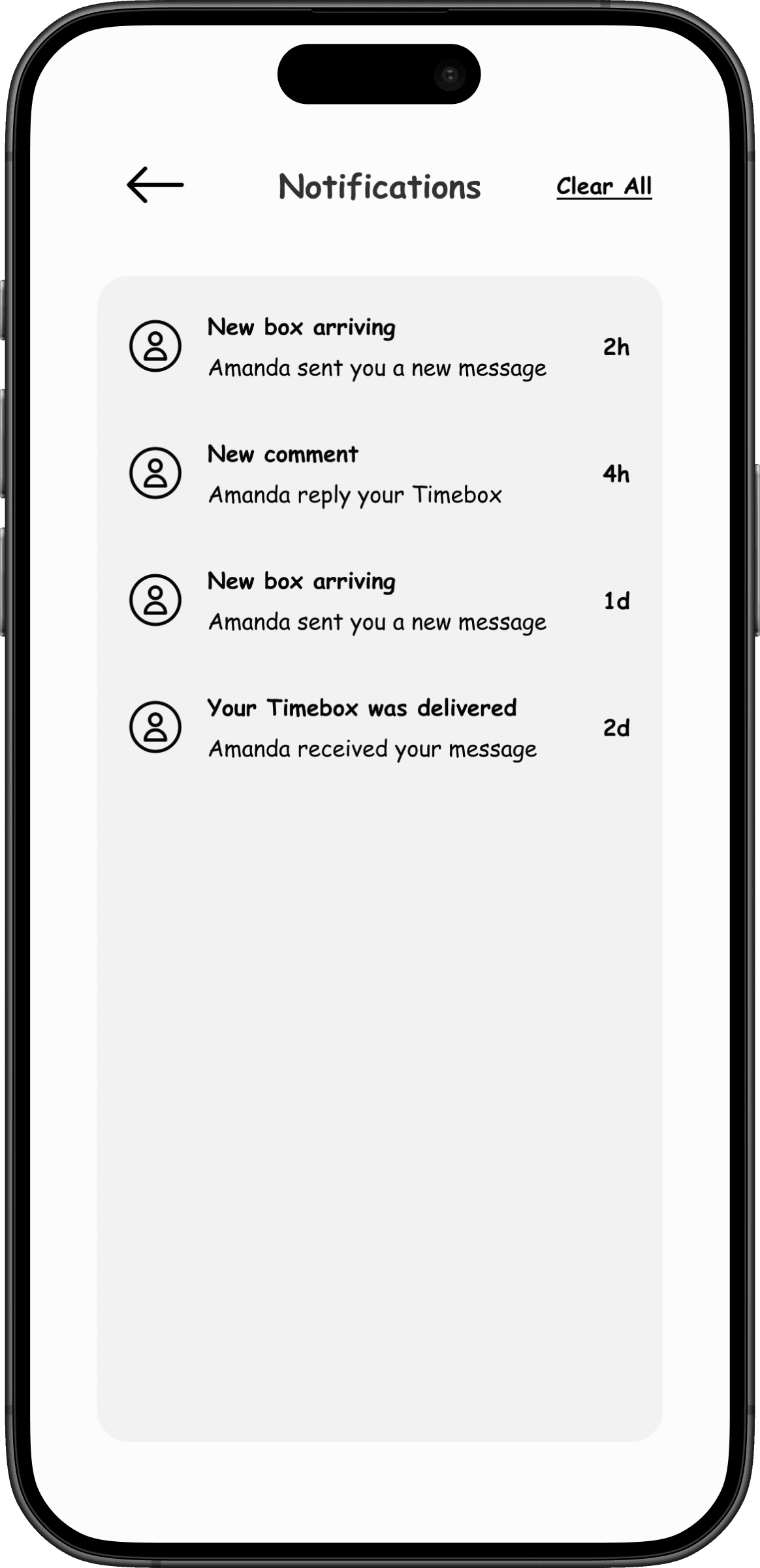
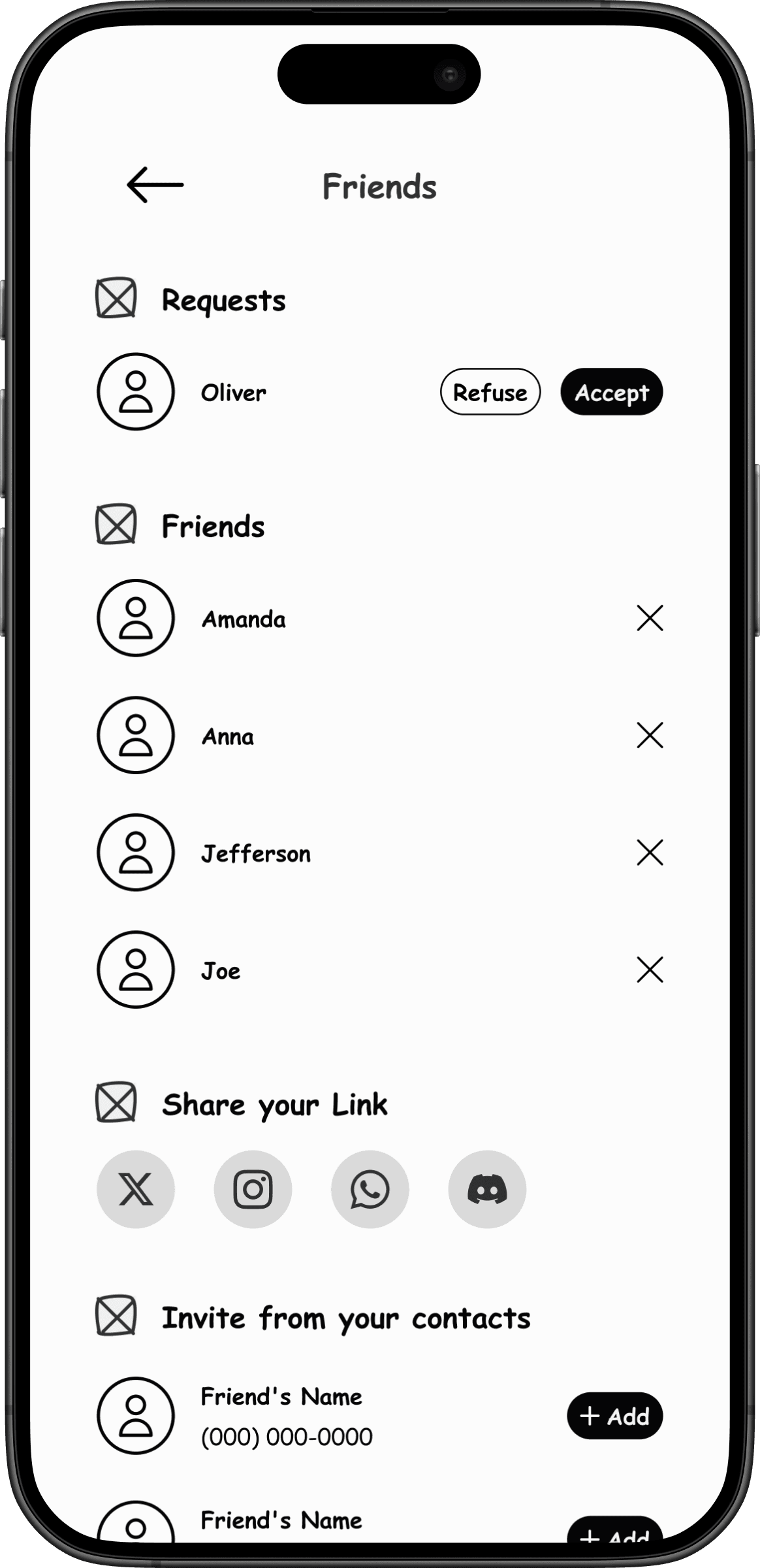
I mapped out the full screen structure and user flows, ensuring all features were organized in a clear hierarchy. The primary goal was to let users schedule a message as quickly and smoothly as possible.
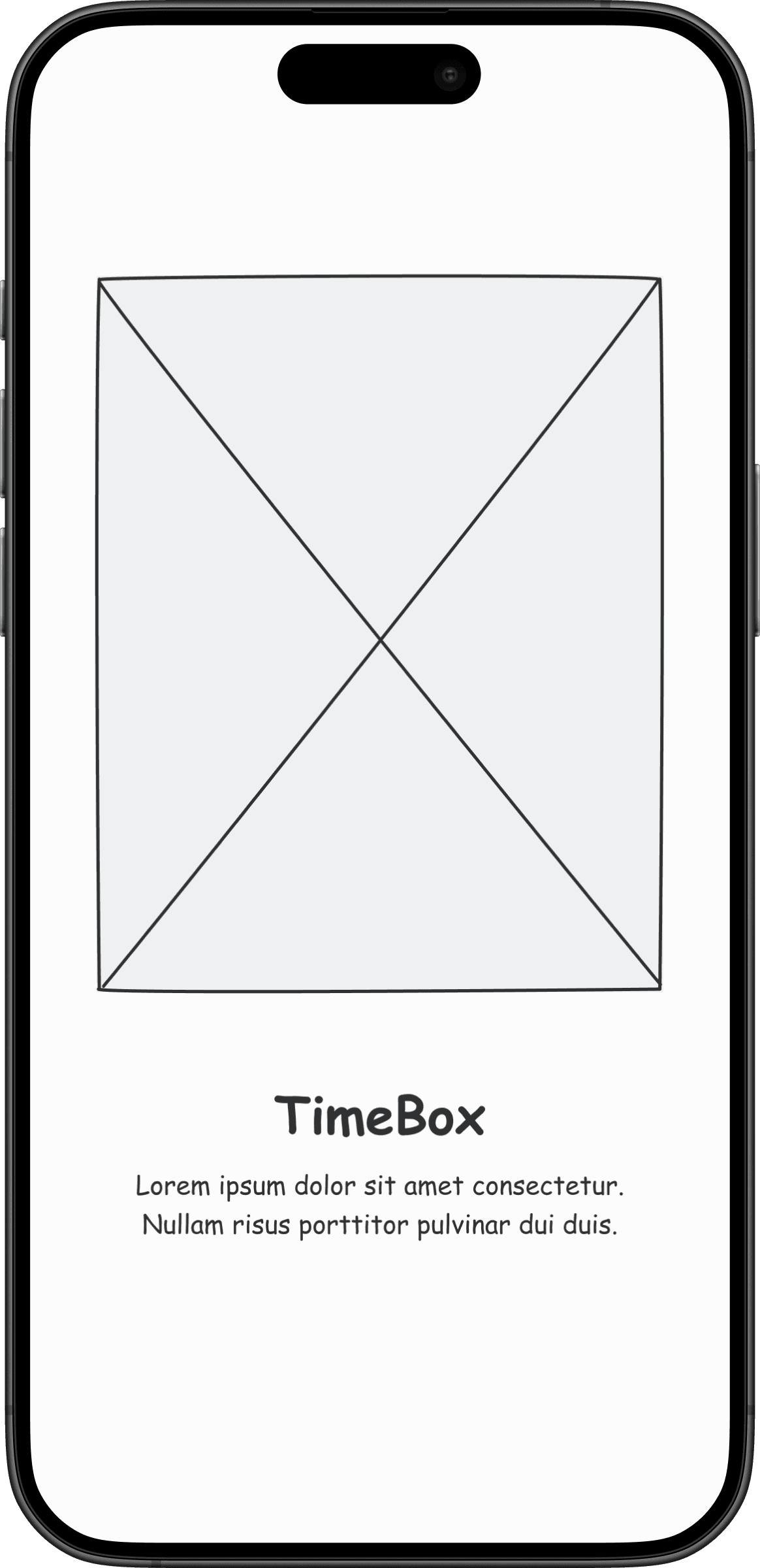
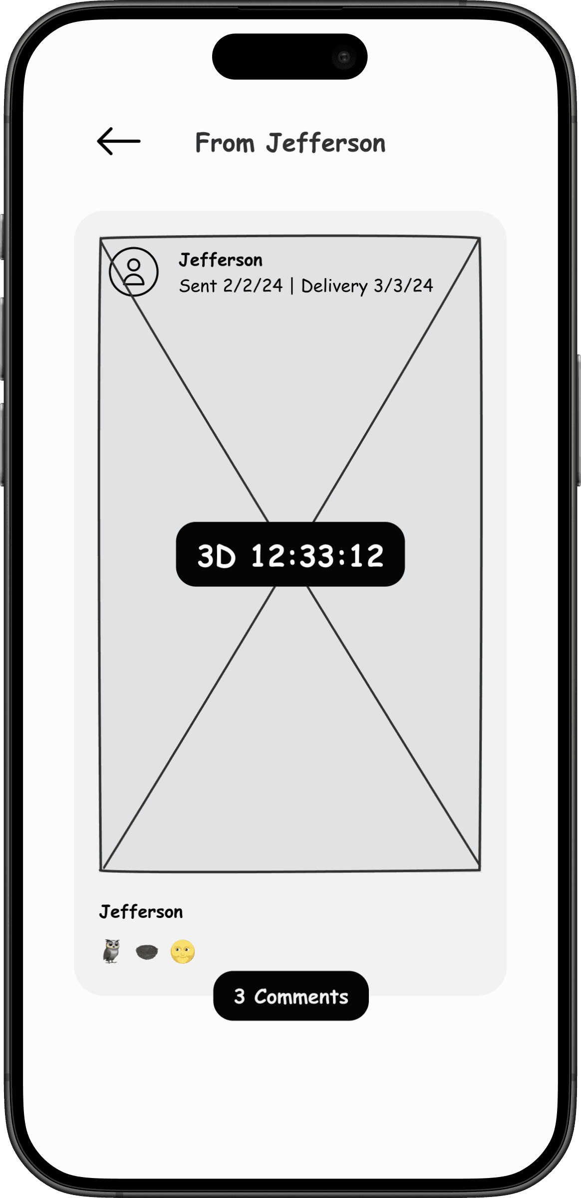
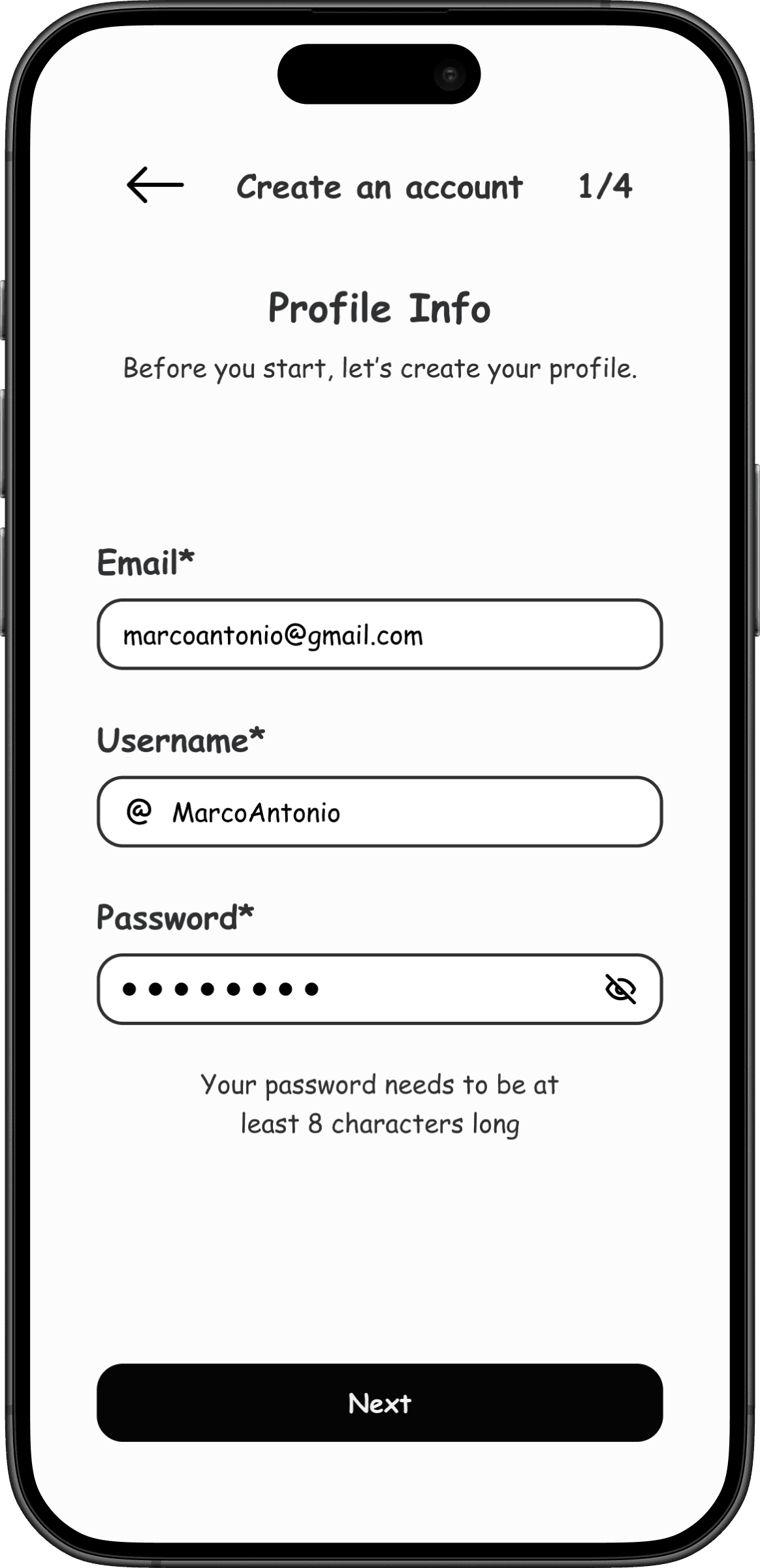
I then designed wireframes for all screens, focusing on content structure and interaction patterns. Due to project constraints, we couldn’t run external usability tests at this stage. To compensate, I led internal testing rounds with the team to identify friction points and refine the experience before moving to high fidelity.
Visual Identity & Final Interface
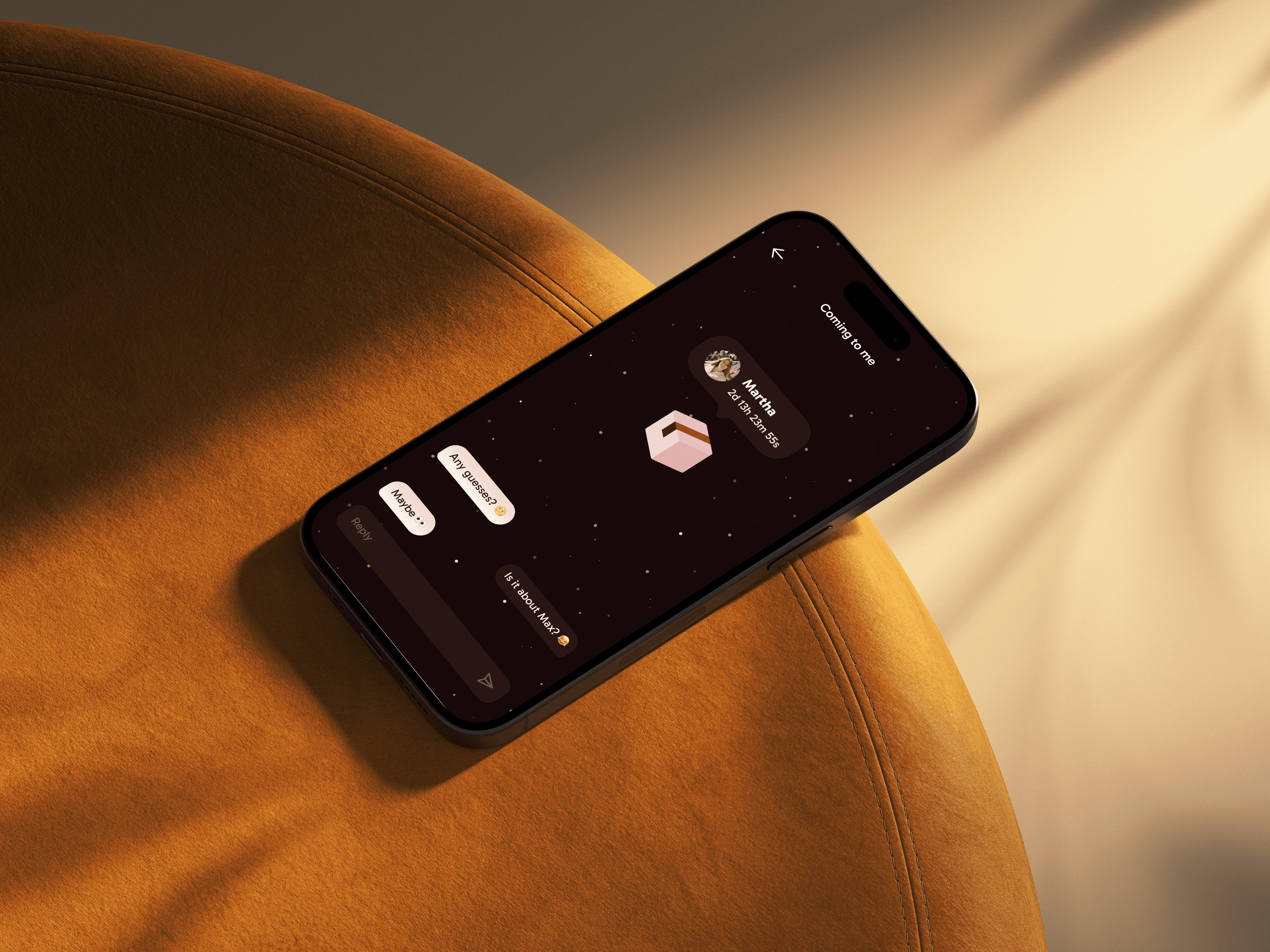
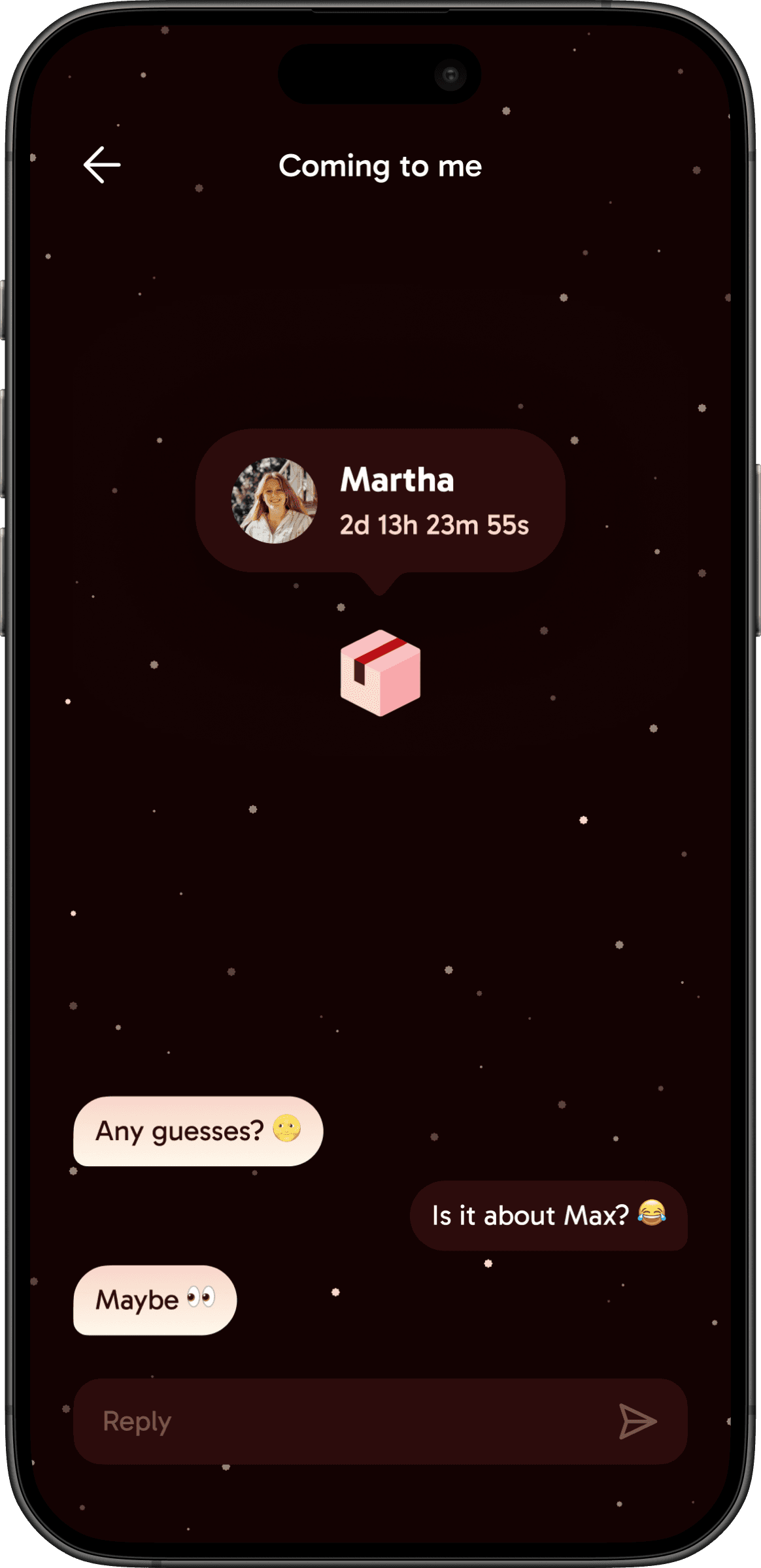
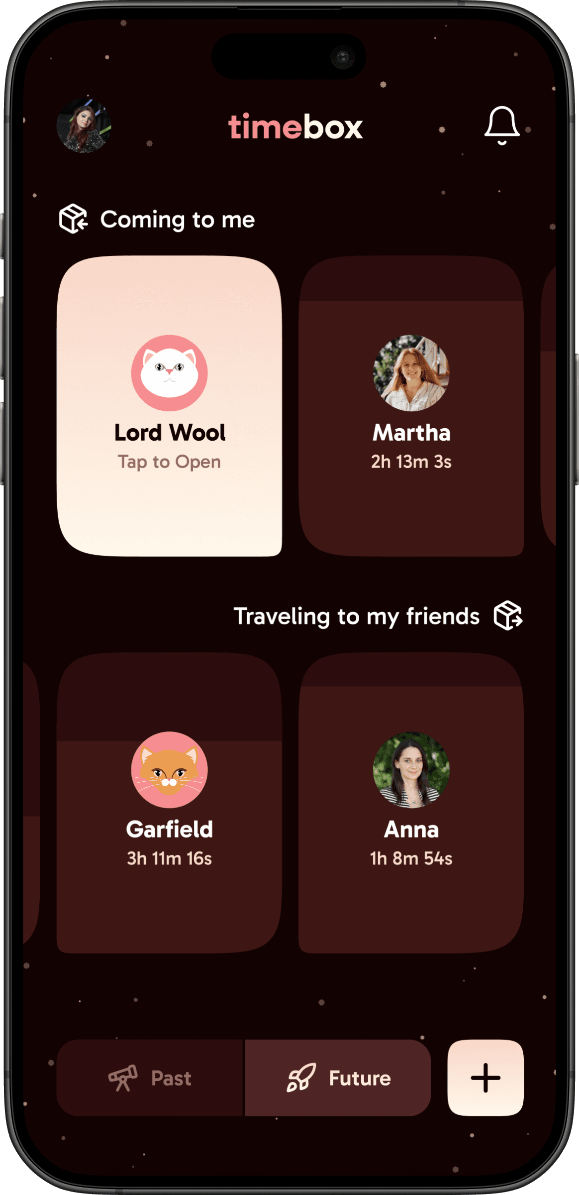
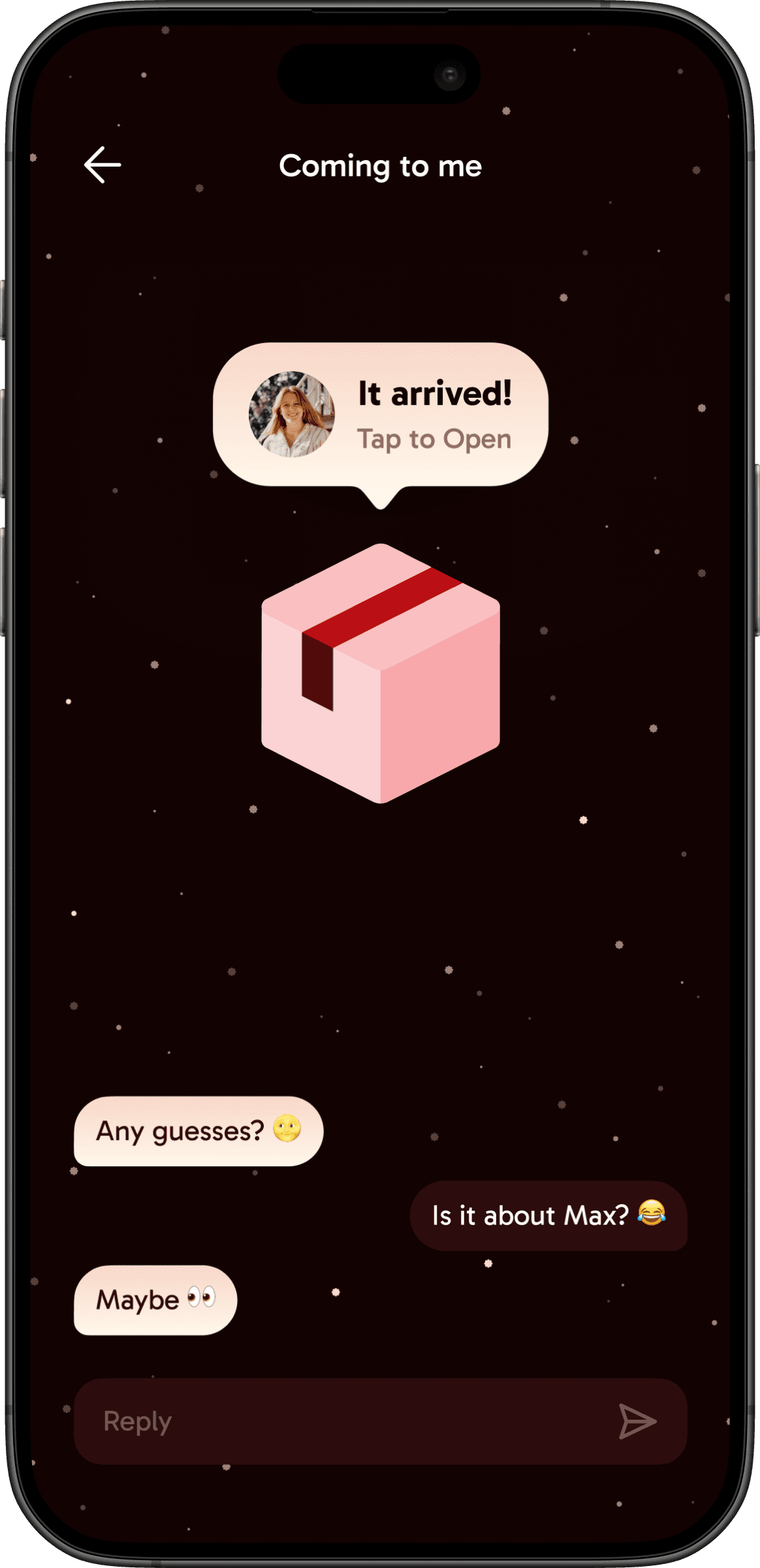
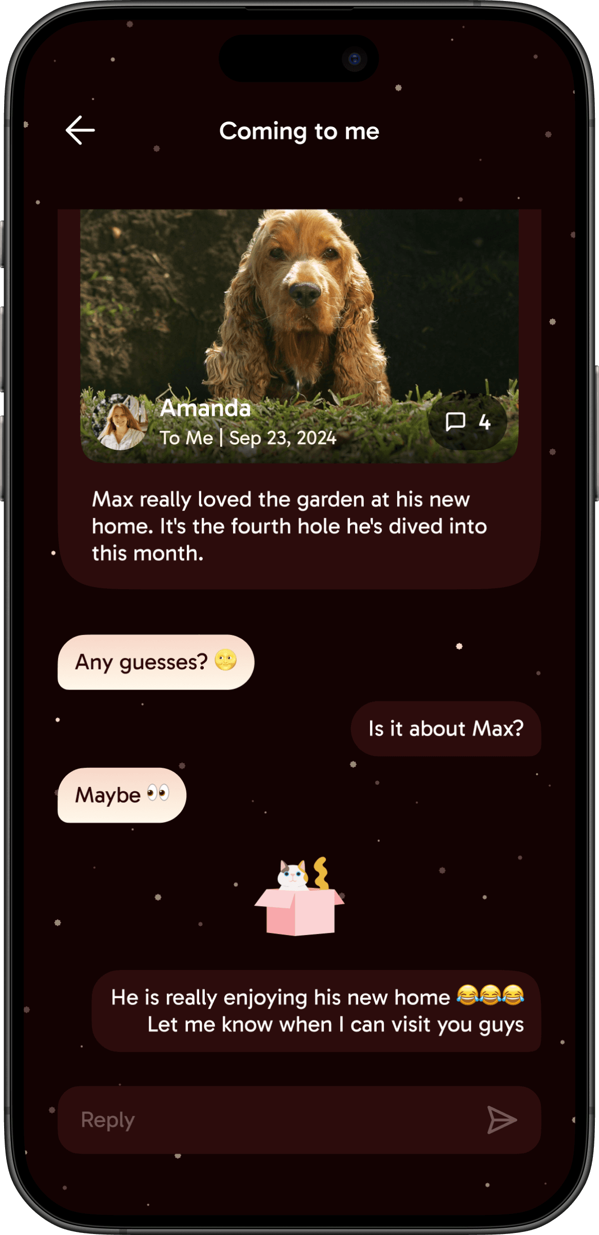
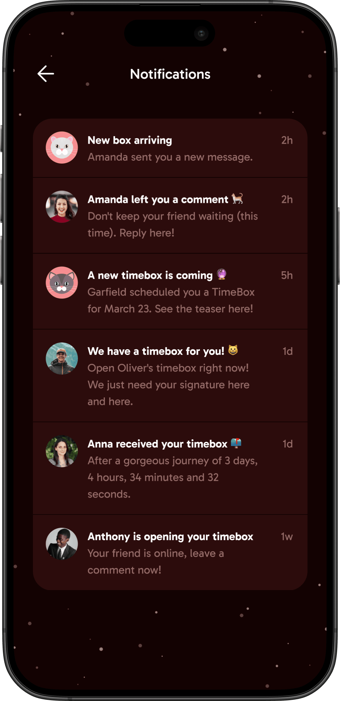
The visual identity was built around the product’s core narrative: a warm, welcoming space for close friends. I worked with the metaphor of time and space, where each message is a “time box” sent through the app. A cat character that appears after the box is opened became the brand’s signature element. Adding personality and emotional connection.
My background in advertising was a key differentiator here. Building a compelling brand story isn’t something every product designer brings to the table, and in this project it shaped not just the visuals but the entire emotional layer of the experience.
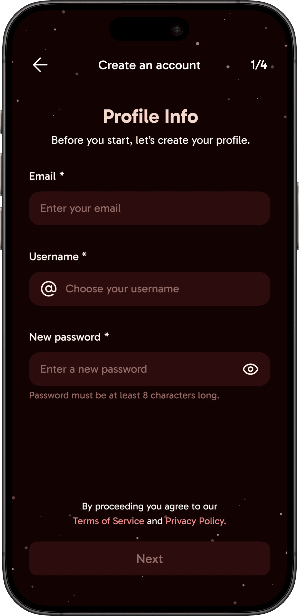
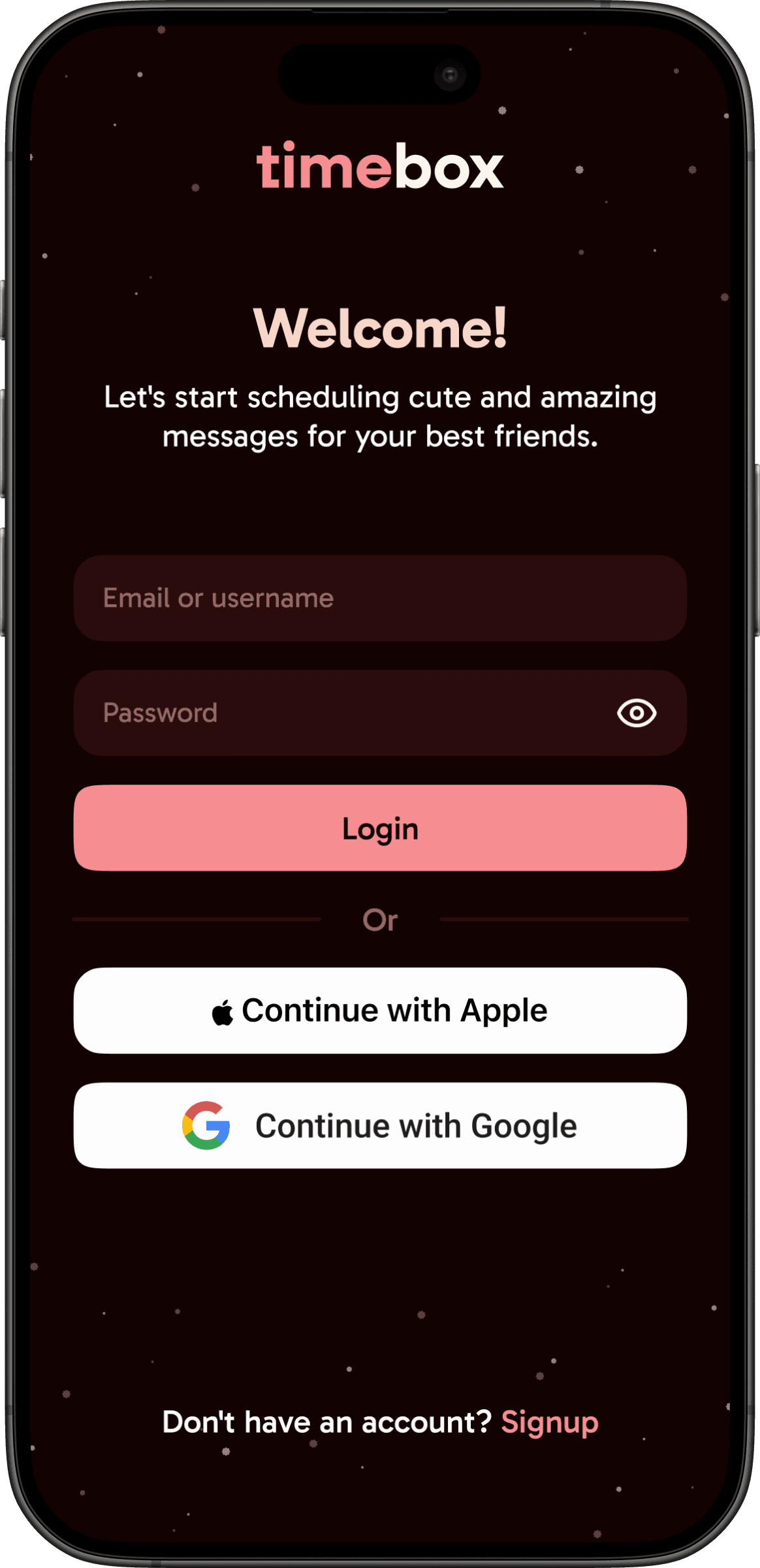
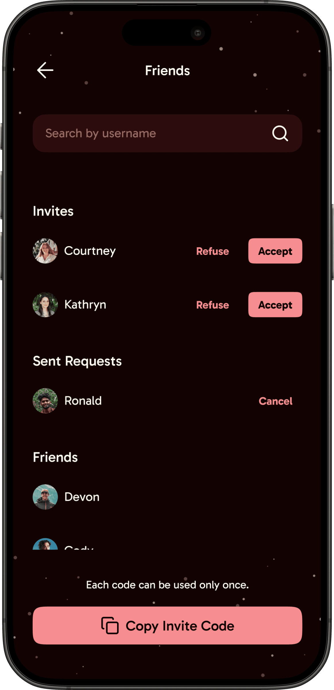
I applied the style guide to the wireframes, refined every component for accessibility and consistency, and delivered the complete set of high-fidelity screens ready for development.
Results & Impact
The project resulted in a fully designed MVP with validated user flows, a distinctive visual identity, and all high-fidelity screens documented and ready for the development team. By advocating for a research phase that wasn’t originally planned, the product was grounded in real user insights rather than assumptions — fundamentally shaping its direction.
Delivered
MVP
Storytelling
New
Research
Deep
Insights
This project reinforced two things I carry into every engagement. First, advocating for research pays off — the initial brief skipped it entirely, but the insights we gathered from users and market analysis ended up shaping the product in ways no one anticipated. Pushing for that phase built trust with the client and resulted in a stronger product.
Second, storytelling is a design tool. My advertising background gave me a lens that most product designers don’t naturally bring. The narrative of the “time box” and the cat character weren’t decorative — they were strategic decisions that defined the emotional experience and gave the brand a memorable identity from day one.